Rolling Thunder
Roller Poster
I was rather surprised I couldn't find a thread on this (and if there is and I missed it just delete this) but I thought it might be fun to discuss some of the best color combinations for roller coasters out there.
Personally I really think that Cedar Fair rules in this category, there newer coasters (with maybe the exception of Valravn?) really stand out to me such as Banshee, Fury, Gatekeeper, etc. But other than that there are a few coasters that have surpassed my expectations in how stunning they look, such as
Personally I really think that Cedar Fair rules in this category, there newer coasters (with maybe the exception of Valravn?) really stand out to me such as Banshee, Fury, Gatekeeper, etc. But other than that there are a few coasters that have surpassed my expectations in how stunning they look, such as
- Wicked Cyclone - I actually didn't think this would be so great, as I always thought blue rails would have been a better choice. After visiting the park recently though, The bright orange really pops out and fits with the area, and the grey supports give the structure that gloomy/stormy feel that I believe they were going for while still looking modern.
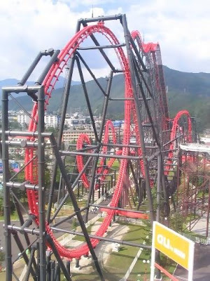
- Raging Bull - While the colors have faded on this coaster (the red is becoming a weak pink) it still really pops out! I'm not sure why, but it looks good with the way the coaster wraps around itself multiple times and just fits the area well. Also decent theming for a SF park.
")