What's new

MARCH 15th- UPDATE!

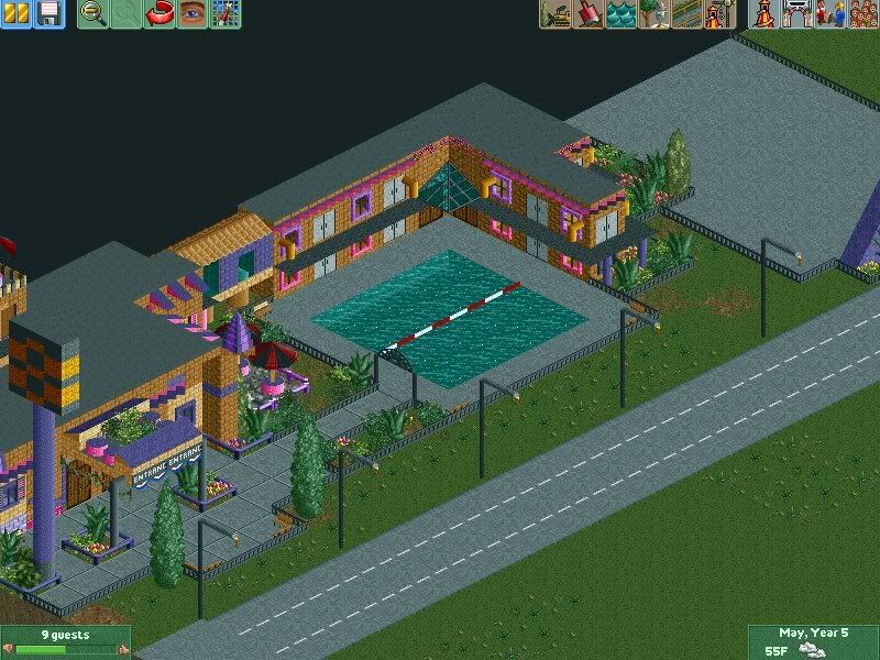
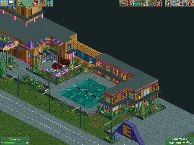
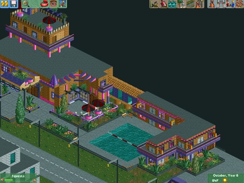
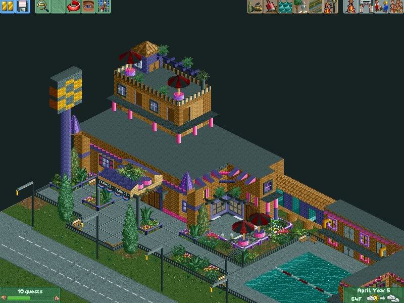
Okay, I just started this yesterday, and I decided that I'm not going to go directly into making a park, but rather, do a whole area with the hotels and the road leading up to the park etc. So far, I've built one hotel and started on the road, but I want comments and suggestions, and even criticism, as long as it's constructive.

SCR11.jpg


SCR12.jpg


SCR10.jpg


It's a Super-8, clearly good bargains!
 
I'm impressed! You've improved quite a bit.

Some things I would change/modify:
- Super 8's are generally red/yellow/black
- Consider the scale compared to the RCT peep. You have a bunch of 1x1 rooms that are supposed to have a bedroom and a bathroom... I would double or triple your room size or something.
- A lot of hotels have a canopy where you can drive right up to the front. You could see if you could work that in somehow.
- The balconies are good, although it would be nice if you could put railings on the front, remove the support pieces (are those lights?), and maybe even consider using a piece with a little thickness (isn't there a square art deco piece in the bench?).

That being said, I'm really impressed thinking back to your older stuff. I can see you've spent a little time on composition. I think with a little more refinement and thinking about why you're placing every single piece, this could be something really nice.
 
As well as the railing for the balconies, for the larger roof at least, why not make a large balcony 'common room' type thing, with some benches, tables etc? Will make it look more interesting than just a flat roof.
other than that, looking very nice! Can't wait to see more.
 
Some things I would change/modify:
- Super 8's are generally red/yellow/black

Haha, not around here! It's all yellow and black, but I do have the sign the wrong way round; should be a black 8 and a yellow background. I think I may have gotten carried away with the purple and pink, but I don't like abundances of brown with no colour to break it up.

- Consider the scale compared to the RCT peep. You have a bunch of 1x1 rooms that are supposed to have a bedroom and a bathroom... I would double or triple your room size or something.

Yeah I should probably do that. The rooms are 2x1 actually, and seem to resemble the size of small motels I've stayed in, but I could probably fix that up.

- A lot of hotels have a canopy where you can drive right up to the front. You could see if you could work that in somehow.

Had that actually, but I really disliked the way it looked and just wasn't working for me. It was also hard because I'm not going to be using zero clearancing for this, so my items kept disappearing. In the end I think I'm just gonna stick with this for now, but if I can make a road work, I definitely will.

- The balconies are good, although it would be nice if you could put railings on the front, remove the support pieces (are those lights?), and maybe even consider using a piece with a little thickness (isn't there a square art deco piece in the bench?).

The support pieces are just nothings. I kind of put them there at first as supports to keep the balconies up since I didn't have any supports going to the ground, but they do look a bit silly. Then I realized they were a good way to break up all the brown, but I guess it doesn't really work! I'll put thicker blocks on there as well.

That being said, I'm really impressed thinking back to your older stuff. I can see you've spent a little time on composition. I think with a little more refinement and thinking about why you're placing every single piece, this could be something really nice.

LOL, remember the first park I posted on here with "Kryptonite"? I thoguht that was so sick at the time but lookin back it's a bit disgusting.

I do need to take more care in terms of placing objects because sometimes I just put things anywhere to make it look good without thinking of what makes sense.

As well as the railing for the balconies, for the larger roof at least, why not make a large balcony 'common room' type thing, with some benches, tables etc? Will make it look more interesting than just a flat roof.
other than that, looking very nice! Can't wait to see more.

I'mm see what I can do with that, but I don't wanna overload the roof because with my previous parks I never wanted a blank roof as I thought it looked dumb, so I continued junking things up with scenery pieces, so I'm trying to stay more simple this time.

Looks really nice Taylor!

I like the motel type thang you've got going on, looks very realistic!

Merci beaucoup, Arly!

Thanks for the constructive criticism everyone! I'll see what I can do to follow the advice, as well as keeping myself happy at the same time :p .

OH, and what can I put between the hotel and the road? Or should I just leave it blank?
 
I am impressed Taylor! You are a fabulous RCT player. I cannot wait to see more.

As for the colors, who cares. I think they are great! Room size seems to be ok and the balconies could use railings. I really like it though. Let me tell you, I surely don't have the patience for that! :p

Keep it up Tay!
 
I am impressed Taylor! You are a fabulous RCT player. I cannot wait to see more.

As for the colors, who cares. I think they are great! Room size seems to be ok and the balconies could use railings. I really like it though. Let me tell you, I surely don't have the patience for that!

Keep it up Tay!

THANKS J!

Looking back at my old parks, I'm pretty pleased that I'm able to at least get compliments now! It doesn't require too much patience, I mean, I don't sit there and plan stuff out, I just go with the flow pretty much.

I'm working on the balconies right now and I'll post screenies when I'm done.
 
By the way, I don't expect you'll be able to easily work it in here, but for future reference when looking at scale, a bathroom for a single occupant takes essentially 1 tile. For a general bathroom within the park, I'm using 8 squares (4 men, 4 women). Taking that and translating it into a full hotel room (bed + bath), I think you're looking at maybe 8 squares minimum. I know this is something pretty much nobody else does (and I kind of like it that way :p), but I find that doing the interiors helps develop a scale. Actually make the bed or toilet or whatever. It really forces you into the right scale.

Anyway, not really a comment on your park, but just some general musings since I was talking about scale earlier.
 
Alright, I see where you're going Brian, but I don't think I'm going to make my hotel rooms eight tiles big. That would just look a bit dumb, so I think I'll just keep it the way I have it.

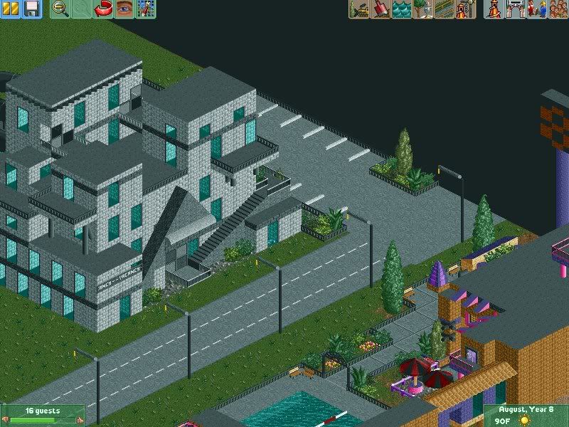
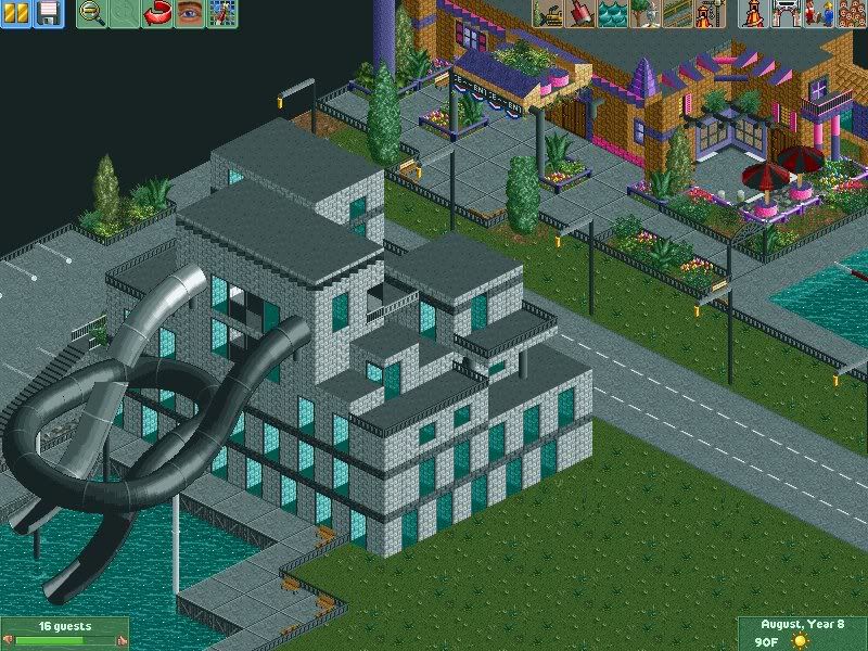
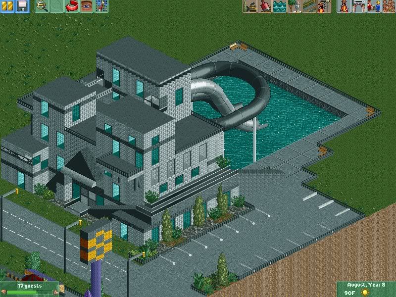
I tried to make a road leading up to my hotels but it looked lame, so I just added the new balconies and fences. I also made a new hotel, complete with a few waterslides.

Screenies:

SCR5.jpg


SCR9.jpg


SCR8.jpg


SCR10-1.jpg


Again, constructive criticism is appreciated, especially for the new hotel as there is something about it that I don't like but I can't pick out what it is!
 
Well, what can I say?
This is a massive improvement from your other work, I do like what you've done. The first hotel has that proper RCT feeling to it - I do like it. Apart from the 'realism' (see CP6 post) you've done a fairly good job with it.
The new hotel, I'm not so keen about - what you have to think about is this.........If you saw a hotel like that would you like it/stay in it?
It looks puny, a design like that looks like it should be bigger, if you know what I mean? The colours clash rather badly with what's opposite the road. Sure you do find hotels hat seem out of place but I think what you've got just isn't working.

The thing you don't like about it? Maybe, now this is just my opinion, it looks rushed......(maybe)
I do see where you're trying to go with but you need to get the scale right - your design needs to be bigger.

I feel it's not complete so I shall reserve my judgement until I see more screens.

--------------

Coaster_Monkey
 
Everything is black, as opposed to the very colourful motel. Aslo, the brick walls indoor are reminiscent (sp?) of prisons.

Also, have in mind everyone, that a tile in RCT2 is far from one square meter. I think the rooms are big enough.

And Taylor, I want to see rides! Can't wait to see how you make a station building!
 
Damn, I'm not pleased with your comment, Coaster Monkey!

Nah, I'm only kidding, and I know exactly what you mean when you say it should be bigger. It wasn't rushed though, I mean, the first motel took me maybe five hours to finish everything, and this one took maybe three.

The thing with the colours and designs clashing, if you think about the road leading up to Cedar Point, it has tiny, crap motels right across the road from big hotels such as Kalahari and Great Wolf Lodge, etc.

I'll see what I can do with it, I suppose.
 
Oh no, I understand that......I really do, it's just on your map it looks so out of place.
Like I said, I'll reserve judgement until I see more - this is because once you fill the surrounding area I'm sure it'll fit in. It's just because, right now, your map is plain the building looks too odd.

I'm sorry if it sounded too arsey when I said it might have been rushed - it's just, and this is my honest opinion, it looks too rushed. I know things like this take a long time, so kudos to you.

A building like this should have a bigger footprint or have the same footprint but taller.

---------------

I'm looking forward to what you've got in store (right now my Docklands Park is lacking and I'm trying to steal ideas left, right and center) ( ;) ) Ha!
But really, please keep up the good work - I miss your Willy Wonker style park.......

---------------

Coaster_Monkey
 
Great improvement on past work I've seen from you, but I'm still not completely sold on it.

The first hotel, I don't like the colours much, and the rooms do look a tad small.

The second hotel just looks like a prison. I can tell what you were trying to go for with it, but I suggest not using grey, and using a colour such as white to make it a bit more grand. Also, I don't like the 'windows'. I think you should just try using normal windows.

Keep it up though, if you keep improving at this rate, you'll become one of the best players around here pretty quickly :)
 
Ah, good thing you brought that up Trav (windows). Maybe she should try decorating the frames of the windows before replaceing them. Right now all looks plain around 'em, maybe that's the problem?

Coaster_Monkey
 
It's not just that. I just don't think that the long glass type things look right as windows.

I've never seen a window thats that long compared to it's width. If they were in pairs, then I could probably go with it, but on their own, they don't look right. They look like they're placed at random intervals at some points as well.
 
Actually I see what you mean now Trav, there is an odd mish mash of windows there. If the building was taller I'd say it'll fit - say, Sky Scraper wise......Actually, it'll be great to see a cheesy high rise building midway through the strip.

Coaster_Monkey
 
Alright, what if I made the hotel brown instead of grey? Would that look okay, or would that be too much brown in the area?

EDIT- I may actually just start on the actual park and then come back to the actual hotels later, that way I know how much room I have, and it'll be easier to plan things out better.

Any suggestions on how my park should be themed, etc?
 
Very good! I don't come here much at all so sorry if this post utter trash, but anyway, the pool on the first sceen shot of the topic; is that a train crossing bar going across it? or is it an ollosion (sp?)?

Also, its awsome ;)
Keep up this awsome work!
 
Actually I see what you mean now Trav, there is an odd mish mash of windows there. If the building was taller I'd say it'll fit - say, Sky Scraper wise......Actually, it'll be great to see a cheesy high rise building midway through the strip.

I may just delete that building and start it from scratch. I can't stand deleteing and re-doing, so it'll be easier just to start over. I kind of liked it, but whatever. I'm also really bad at making skyscrapers.

Deano, the train thing is the line that you often see in pools separating the shallow end from the deep end.
 
Top