It's still early days yet and with most attention going on over at the Zufari site I wasn't really expecting anything new elsewhere in the park. I'd heard last year that Burger King was being removed and replaced with a new in-house restaurant. Turns out this was true and they've clearly decided to put a decent budget behind it. They seem to have taken the decision to renovate most of the Transylvania area while they're at it.
So let's have a little look at the exterior changes at the new burger place...
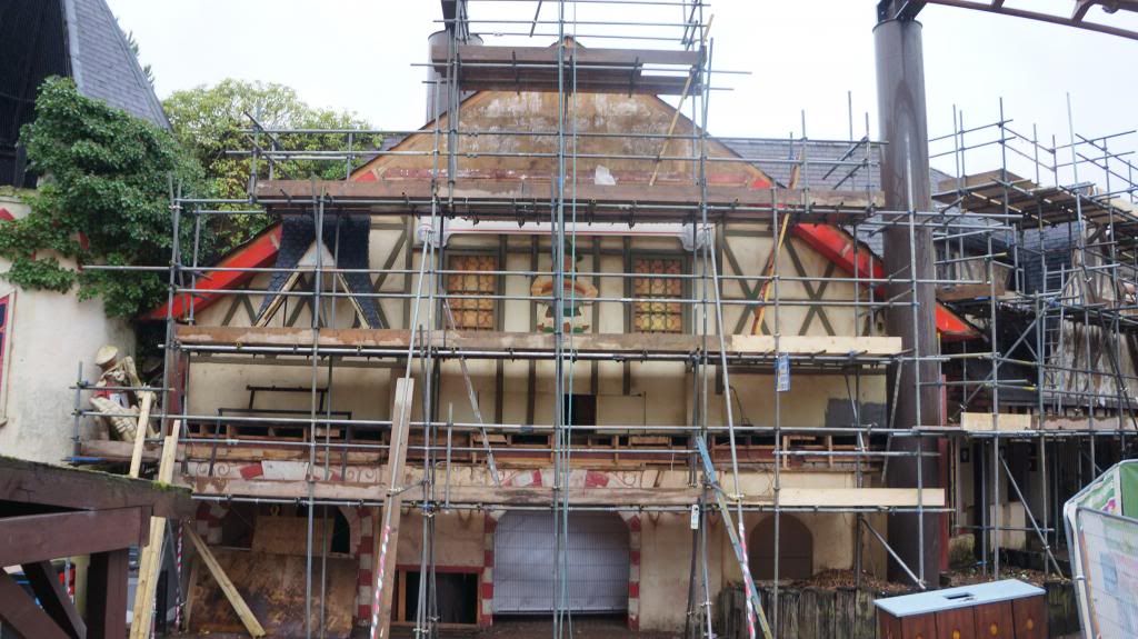
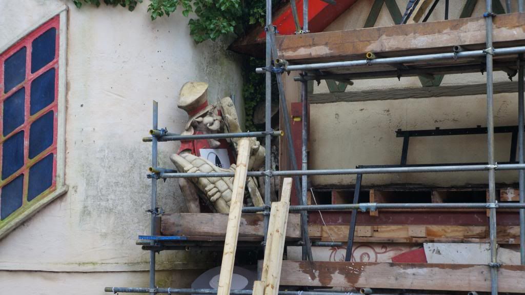
As you can see they're still at the point of removing the old exterior. However the upper section of the main building looks like it's close to its final appearance. As you can see clearly in the below photo a new character with a giant burger has been added.
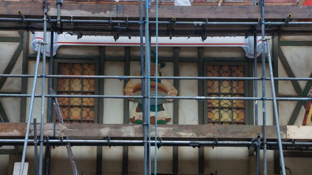
Goon shot...
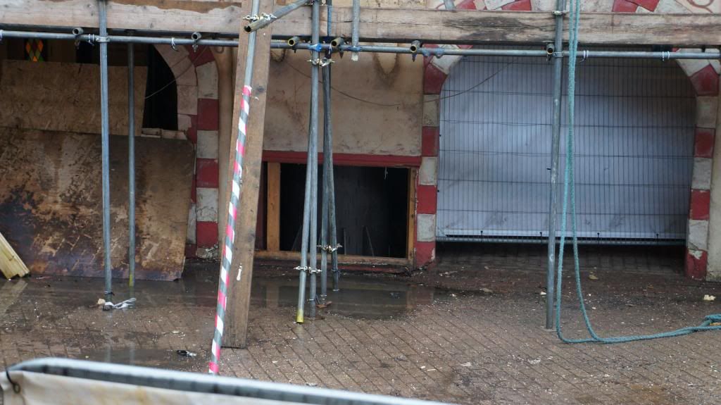
Goodbye old theming...
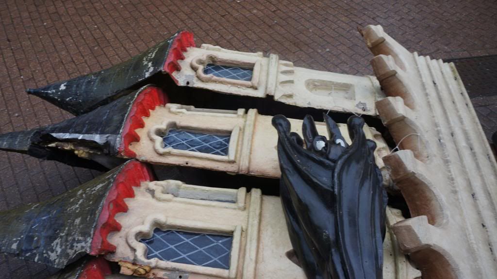
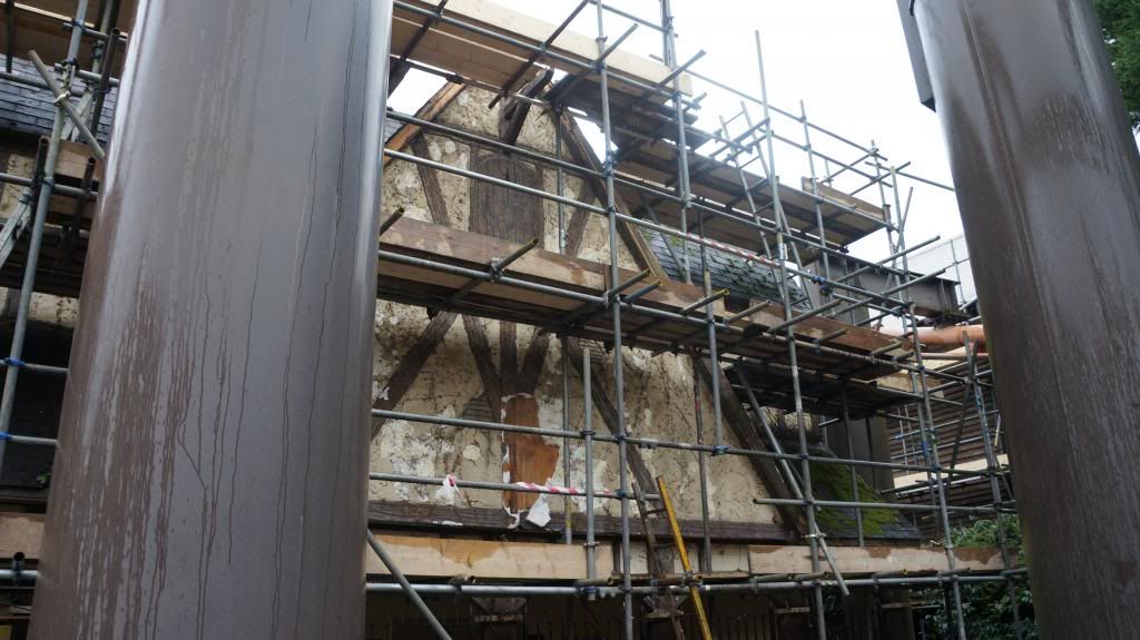
They've only really starting tearing back the old decor on the other side so far...
Elsewhere they've changed the old refresh cafe (the one with fake snow on the roof) into a whole building. It's already open and although it's mainly just a change to the exterior/extension of the original building the new style is much brighter and welcoming.
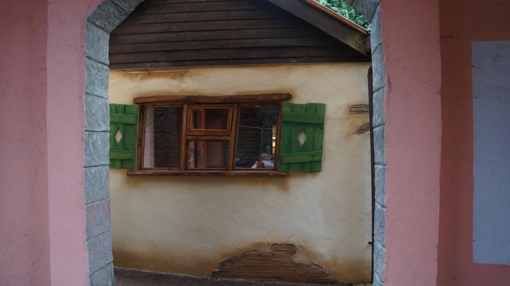
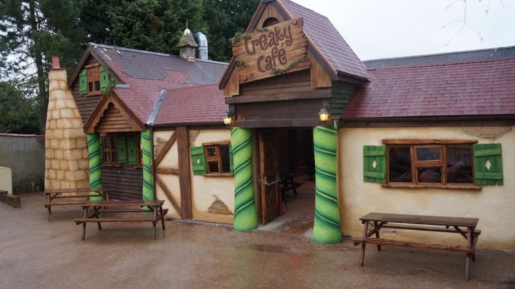
It feels a bit rushed (just look at the roof) and the interior looks even more unfinished but this could be due to them trying to get it ready for Zoo weekends. Some of it feels a bit poorly designed too, for disabled access there is a ramp to the side of the building which is squeezed in next to the tower but it looks really tight for say a wheelchair.
Inside there is also a little kids playing area (a few toys) but that looks really unfinished (walls were just bare wood). Concept art which found its way on to the net last month shows that a fake fireplace is/was planned where the kids area is. It's also a bit weird that they've just kept the old picnic benches inside so although you're now enclosed it still feels outside.
The Vampire/Bubbleworks shop was also gutted and given a new lick of paint and the main counter has moved into the center. Once again, unfinished for the moment.
Chessington do like to keep adding and improving over the season so it'll be interesting to see if there are any other small surprises for us regulars this year.
So let's have a little look at the exterior changes at the new burger place...

As you can see they're still at the point of removing the old exterior. However the upper section of the main building looks like it's close to its final appearance. As you can see clearly in the below photo a new character with a giant burger has been added.

Goon shot...

Goodbye old theming...


They've only really starting tearing back the old decor on the other side so far...

Elsewhere they've changed the old refresh cafe (the one with fake snow on the roof) into a whole building. It's already open and although it's mainly just a change to the exterior/extension of the original building the new style is much brighter and welcoming.


It feels a bit rushed (just look at the roof) and the interior looks even more unfinished but this could be due to them trying to get it ready for Zoo weekends. Some of it feels a bit poorly designed too, for disabled access there is a ramp to the side of the building which is squeezed in next to the tower but it looks really tight for say a wheelchair.
Inside there is also a little kids playing area (a few toys) but that looks really unfinished (walls were just bare wood). Concept art which found its way on to the net last month shows that a fake fireplace is/was planned where the kids area is. It's also a bit weird that they've just kept the old picnic benches inside so although you're now enclosed it still feels outside.
The Vampire/Bubbleworks shop was also gutted and given a new lick of paint and the main counter has moved into the center. Once again, unfinished for the moment.
Chessington do like to keep adding and improving over the season so it'll be interesting to see if there are any other small surprises for us regulars this year.
