What's new

British Theming

Kebab

Giga Poster
Britain has always been a stereotypical grey country, which brings me to this subject. I'm getting sick of British theme parks (specifically Merlin), and their dark, depressing theme concepts, it's getting far too over-used now, I appreciate Nemesis and Oblivion for it, but in the past 5 years we've had Saw: The Ride, Th13teen, The Swarm, The Dark Forest re-theme and Nemesis Sub-Terra. The whole 'dark greys' and 'black' track colour schemes are beginning to bore me now too, when will we see another bright thrill coaster like Colossus and AIR? Or just something unique in terms of theme?

I might be blabbering on, but whats your opinions on British theming?
 
^I think you're looking incredibly narrowly at what the British parks have offered in the past few years. What about Nickelodeon Land, with its bright green and orange colour scheme, or Peppa Pig World? Or even something like Ben 10 (again, bright green!). Just because the big guys are painted black (which I think makes them look more badass anyway) doesn't mean everything is!

I like the way we theme and colour our bigger rides. The washed out tones and darker colour schemes make the rides seem bigger and scarier than they actually are. If they swarm were bight yellow and blue or some other obnoxious colour scheme that we tend to see overseas it'd have a massive effect on the overall impact of the ride.

I do, however, agree that the generic theme of industrial kind of style we keep seeing pop up over the Merlin parks is getting a little old now. I'm a massive fan of fantasy style theming (like at Efteling, Phantasialand and Toverland) and would really like to see some of that employed over here, makes places more magical. It could definitely work in a park like Alton and even Chessington.
 
I was thinking about this earlier.

I completely agree. I can see why they want to scare the public, but it's getting old now. Plus it hardly ever REALLY works. I just want a colour coaster. A red B&M hyper would look lush at Thorpe. I love the colours on X-Flight and Wild Eagle, but The Swarm colours are so bland and... eurgh.

I also agree on the theming. Rusty metals and concrete (with containers) is boring. Which is why I like the theming on Stealth. Yes, it's minimal, but the light blues and yellows just makes everything happy, but doesn't make the coaster look any less intimidating. I hate Rita's new theme. It wasn't great to begin with but now it's just...terrible.

I want some theming like Shambhala or Oz'iris. I think more detailed and realistic theming gives a better experience than that on Saw/Swarm/Thirteen.
 
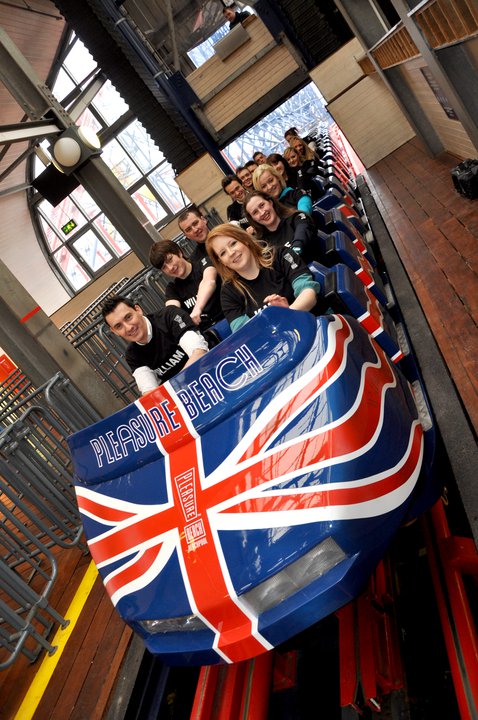
British theming at its best:

181588_10150102248047365_88885897364_6139648_8349115_n.jpg


;)
 
In my opinion, it all depends on what age range they're aiming at. With older guests, it's obvious they're going to go for a threatening/malice theme, as we understand that and it will enhance any "scary" ride. Whereas if say, Oblivion, was themed to flowers & bubblegum, it wouldn't have a cohesive theme, this is all just based on my thoughts and opinions.
 
I covered this in the SW7 topic.

There was always a degree of this with Nemesis and Oblivion (possibly Nemesis Inferno), but it's clear that Candy Holland is having a massive influence on the parks, and what she loves. She loves horror and (I think) Sci-Fi, which is why everything at the Merlin Parks is looking like this (other than the pirate themes cropping up all over - due to POTC being so huge in the last ten years). She's the girl in charge of the new developments and will be pushing the design in a certain direction, which is towards her own vision.

John Wardly did it too. He loved the "darker" aspects and all of his theme park work is on that darker side. His original Haunted House and Log Flume at Barry are a little more darker than the norm. Then Vampire at Chessington, Nemesis, Gloomy Wood/Haunted House, Oblivion, Hex, etc. However, he could also turn his eye and hand to other things (Katanga Canyon/RMT, Colossus, etc). Even there, there's a depth of touch of "darkness" that gives it a realism. Katanga Kanyon is more Indiana Jones than Casey Jones, Colossus is Congo rather than Tarzan. It's just that he managed to have a good range and to differentiate his work.

Ms. Holland seems quite tightly fixated on bringing to life the films/books she loves with her own 'twist' and it's a narrow focus.
 
^I meant to say to you Joey, I read a piece by a film theorist about realism in British film, and how because our budgets aren't half as big as those of the big American companies we fall back on realism because it's cheaper and more believable on a smaller budget. Made me think of you and your thoughts on the theming in British parks ;]
 
we fall back on realism because it's cheaper and more believable on a smaller budget.
Yeah, this is pretty much the key.

And I'd rather, in all honesty, have that - which produces something unusual and interesting, than something which tries to do something that requires a huge budget and doesn't quite capture it. Like say what Lightwater Valley have done. Yes, it's kinda good considering, but it required a bigger budget to make it work really.

Link to said piece?
 
I also wonder how much of an influence planning regulations have? It seems that its often easier to get planning for something that blends into background, than something that's vibrant and stands out. I know that its often only used on the highest parts of a coaster (Rita, Stealth etc) but I do wonder if its also had an influence elsewhere.
 
Joey said:
Link to said piece?

I'm trying to remember where the bloody hell I read it, I've been through so many books this week I can't remember! I'll have a dig though, it's bound to come up ;]
 
I agree, this whole horror "escapism" has gone too far, Ive got three words for you... Nemesis, sub terra.

I dont think somebodys opinion on a genre would change what theme is chosen, I just think the whole thought which parks are having "trying to be different" has resulted in some poorly themed attractions.
 
Top