What's new

Docklands [14/01/2007 - 06/10/08] [New Park - 10/03/10]

Jambo - As scary as you have come across, thank you very much.
I do like to take a lot of time with my projects and try and do my utmost to achieve the best of my RCT ability - many times have I gotten frustrated with RCT, sometimes I cannot put my ideas onto my Map other times I can.
I go through at least 5 designs before I'm happy with what I've got. However, there have been times where I've know I could do better but just couldn't be bothered to adjust.

Scenario edit is the best place to start of with your scenery and design. You cannot go back and forth once you've started your game and have added your coasters......They'll just get deleted. *might be a way 'round it but I'm no expert*

LFTL - Nice to see I've a fan. I wouldn't submit my work, just yet, to another site - but just don't want to.
This is just a CF exclusive.
Thanks anyways......

-------------

A little update.

As you can see in the new Map (posted on 16th) you can make out a new skyscraper - in Theater Square. This is the new home for Channel 4's media & arts company.
It's all made up toss, but *meh*
I'm happy with the design, however, it's a little on the thin side - but if you all can do me a favor and ignore that fact I'll be tres pleased.

The 'C4 Tower' in all its glory. (second tallest building on the Map)
C4Tower.jpg


Theater Square and the newly built tower.....
C4TowerCloseUp.jpg


A market......(why not?)
Market.jpg


....Finally,
The tower that has been on my Map from the beginning - the landscape around it has seen some dramatic (and weired) changes.
I find this shot very beautiful......
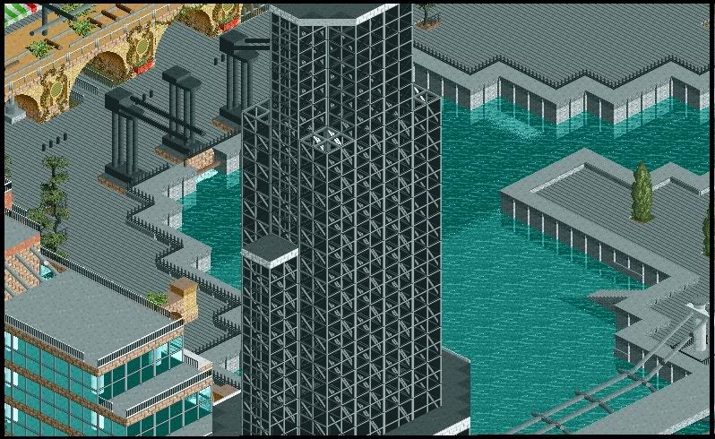
DocklandsTowerPlaza.jpg


------------

Comments appreciated,

Coaster_Monkey
 
Is that big tower inspired by the John Hancock Building in Chicago?
http://www.planet99.com/pix/50_1.jpg

Anyway, it all looks pretty good so far. Really nice composition. I'd definitely send it in for a 'Concept Creation' on New Element since this kinda thing is perfect for that.

One suggestion would be to add color. I know that's a hard thing to work on sometimes, but think of the modern cityscape: you have lots of separate commercial buildings along with the offices. With those separate commercial buildings, you want to define them somehow and make them individually recognizable... of course that can be done solely through architectural form, but when you combine that with different color patterns outside of the white/gray/black/brown, then you'll have a real winner. Don't let the trees and gardens do it for you-- your buildings are good enough and some more color will make them exceptional.
 
Wow, This is amazing.

There isnt much more to say apart from Amazing job. Im sure that you knew what we would all say but you must know just how incredible your archi is.

Great work, this looks fantastic.
 
Ultimate Coaster - And if I were into a fetish like that I'd masturbate happily in the corner while you gave my work a good seeing to.

CP6 - Thanks dude!
No I didn't get inspiration from the John Hancock building, however, I've bloody tried many times to recreate something like that! Gawd, it's awfully hard! It's one of my favorite buildings as it looks so domineering and looks absolutely beautiful. The tools I have in RCT would not cater for something like that....
Yes, colour has been a flaw in this park - I do feel it looks either too sterile and monotonous. It's hard to do something with the pallet of colours in RCT - the only buildings I can build are low rise old fashioned ones.....It is my task to have a skyscraper different to others it's something I'm able to achieve it's just I'm trying all sorts of ideas and not liking any of 'em.

I will go by my only excuse that London now is becoming a 'glass and cladding' city. Everywhere it's just glass and industrial futuristic looks.....
If there's one building I've always wanted to do, but know that with the limits on RCT I'll never be able to do, is this....
Clicky!

-lofty-: Thanks! The new building didn't takelong at all - I'd say 45mins/1hr? It was an idea I've had right from the beggining - I've just been putting it one hold.
I knew what to do and didn't mess around doing it.

Lauz: Wondering where you went, not seen you around on the boards...
Thanks for the support anyways! I know at times I get the same comment but it keeps me going and I really do apperiacte it. Otherwise I would have given up a long time ago.

Thanks for the comments people, keep 'em coming!

Thanks,

Coaster_Monkey
 
coaster_monkey said:
Lauz: Wondering where you went, not seen you around on the boards...

Yeah, It's been A while since I commented. I occasionally looked around the boards, but to be honest there was never really anything to comment on.

But now I feel like Im going to be back as a regular again. Hehe.
 
wow

Wow!!! That is incredible, it is amazing what can be done with RCT2. I thought I was starting to get a handle on all the possibilities, I guess not. The docks look like a great place for an intamin aquacoaster, jk. Anyway, keep up the great work. I wonder if any of these RCT2 creations can be sold for personal gain. HHMMMM...what would Chris Sawyer say :)
 
First update for 2008.

Thank you all for the support you've all given, this has been so enjoyable knowing what I'm creating is being seen by tons of people and enjoyed by tons of people. Really keeps me going.

Thanks.

----------------

I was just messing around with the open space I have and came up with this design.
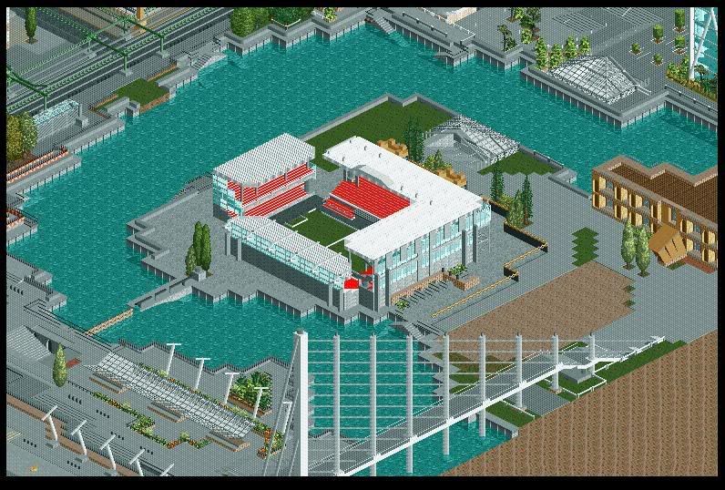
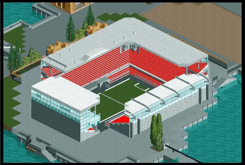
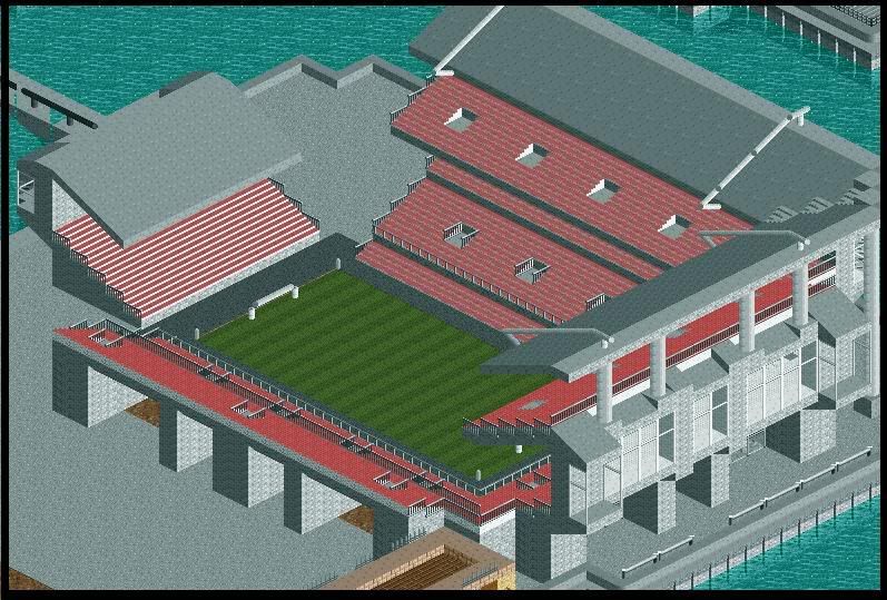
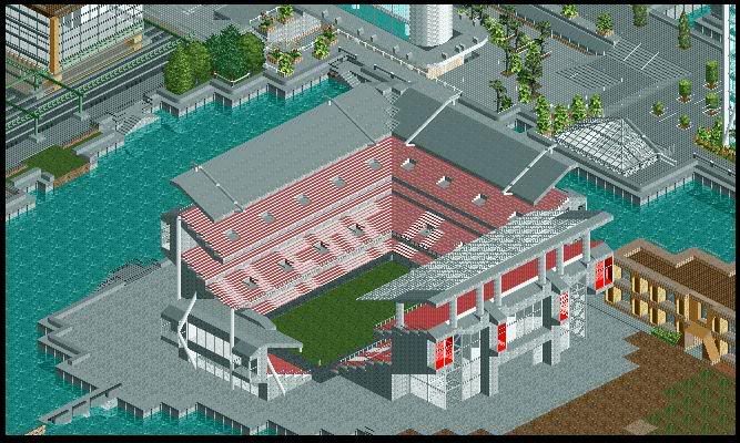
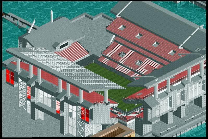
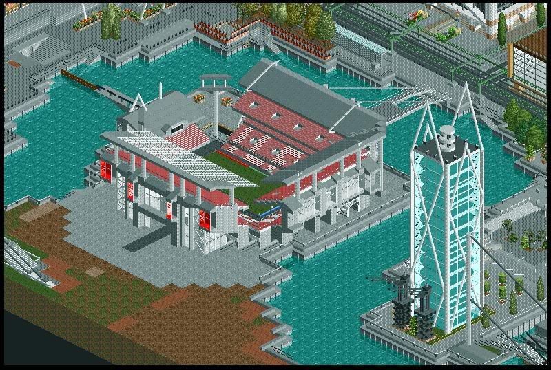
A football stadium.

The design is supposed to be a Championship/Division 1 club stadium. Renovated but still has the 70's/80's facade - tatty by beautiful old school meets new school stadium.

I just had to incorporate by beloved team, West Ham United, Twin Towers for the main entrance:
FootballStadium3.jpg


Another view:
FootballStadium.jpg


Close up:
FootballStadium2.jpg


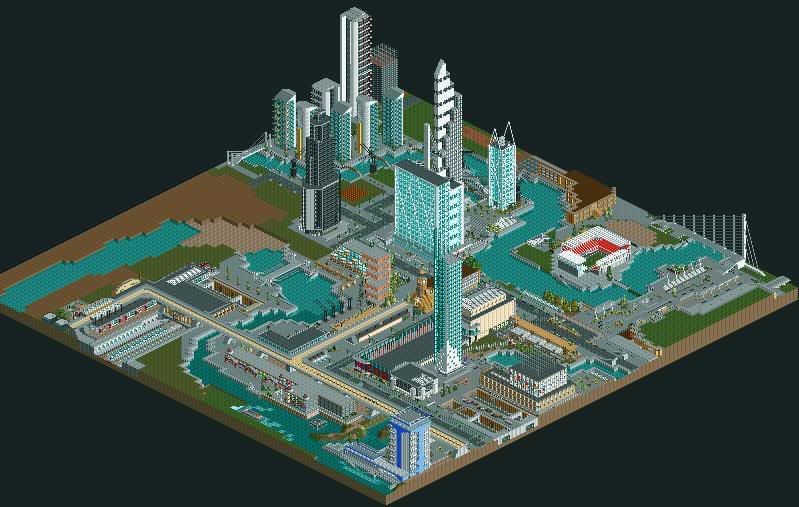
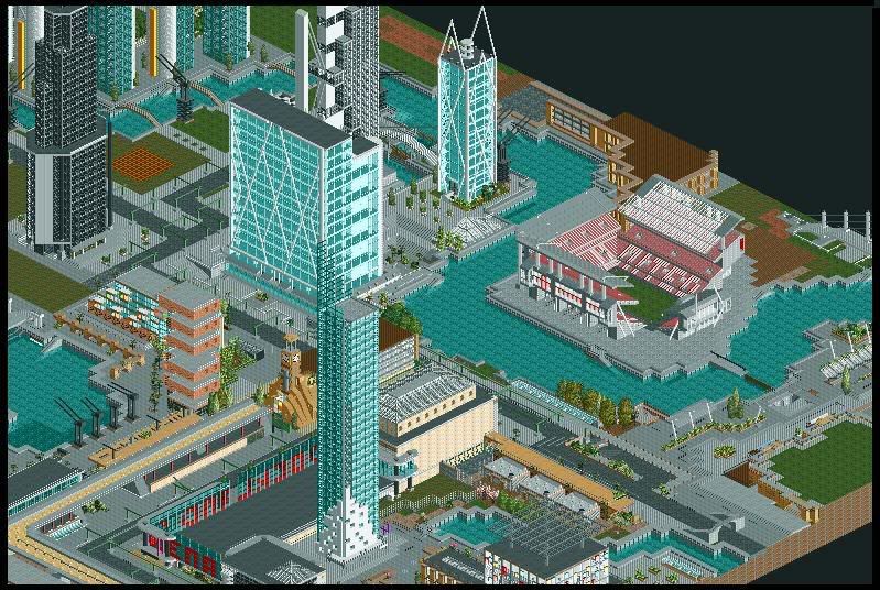
The Map so far:
AsaWhole2008-01-22.jpg


--------------

Comments, as always, appreciated.

Thanks,

Coaster_Monkey
 
Well, once again you've incorperated great architecture and realism, and have pulled off something really nice. The red seats are a bit of an eyesore, but I know a lot of stadiums do use red seats, so it's okay, lol.

Good job though dude, your work never ceases to amaze me!
 
Fantastic work, as always. I love the Stadium, it looks incredible. You've made it look good, considering the restrictions RCT2 gives.

Looks Incredible. Always does. Closw to being Finished I see, and it looks fantastic.

Keep it up! [And Yes, I have dissapeared.]
 
w00p w00p West Ham. :p

But yeah, looks good, but perhaps more detail could go in like stairways amongst the steps.

Also it seems a bit small, in comparison to some of the other buildings.

But noice work mate. :)
 
**** hell! This is by far the best work I've ever seen or RCT2.

I like the way that you have made all the building look real, with little flairs of modern architecture. It looks very good.

Keep up the good work!
 
Wow - I hated this project, but it seems like people thought different.
Unless you were all just being nice, ;)

LFTL - Thanks. On the realism side I'll disagree with, I really felt it looked too RCT'y. The stadium was meant to be something cheap and tacky but I feel that I went about with it the wrong way.
It was too much of a rushed job.
The Red seats I'll agree with - too bright weren't they?

Lauz - And you're back again..... :roll: Where do you disappear to!?
Well, considering the restrictions RCT gives I think I pretty much RCTooned it a bit too much. I kept way within the limits.
Close to being finished? Yea :( I'm kinda sad about it really, I've had such a fun time building all of this crap - don't really want to put it to rest....

Pinapple - w00p w00p indeed young sir. ;)
Perhaps more detail? Damn funking right I needed more detail. And yes, it seemed way too small in comparision with its surroundings - however, saying that, a lot of my buildings seem a bit unrealistic with size.
But that's RCT for ya'.

Hixee - Hey, thanks! Best? Well, I'm not gonna blow my own trumpet....But thanks.
I'm trying so hard to make everything look real - and by the looks of things I'm hitting the spot, only just.
There's tons of work to do - I'm not at all pleased with everything here, a lot of hard work will still need to go into this.

--------------

Okay - so basically I hated the original design. It looked way too small and just very rushed. I don't think I gave myself enough time to sit back and look at what I made, if I did I wouldn't have posted it on the CF-RCTforums.
So, this morning, I woke up and started again. This time I very, VERY, pleased with the outcome. It's just about the right size and seems very pleasing to the eye.

Please know that this isn't 100% complete - all is 50% at the moment

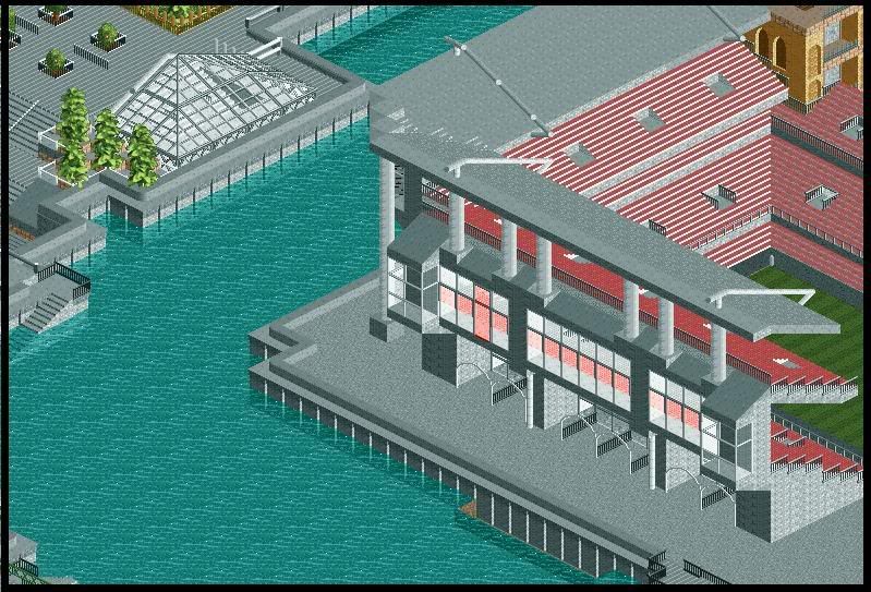
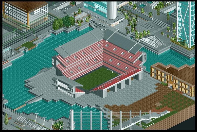
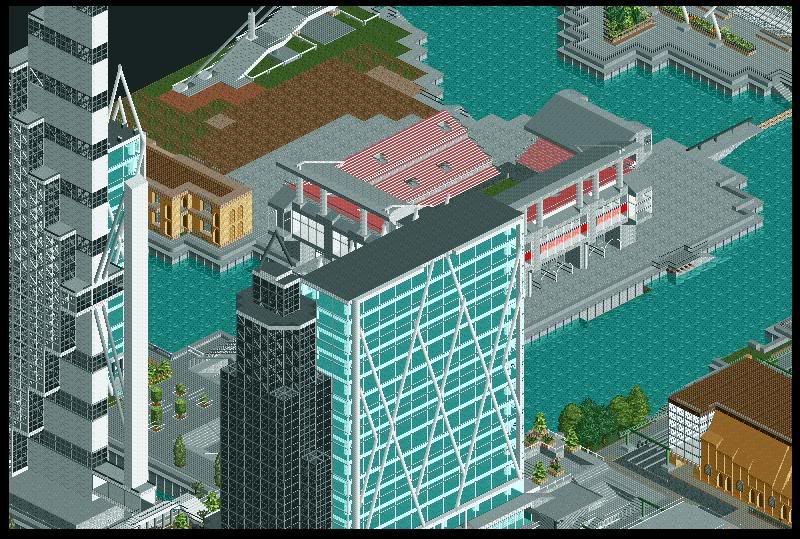
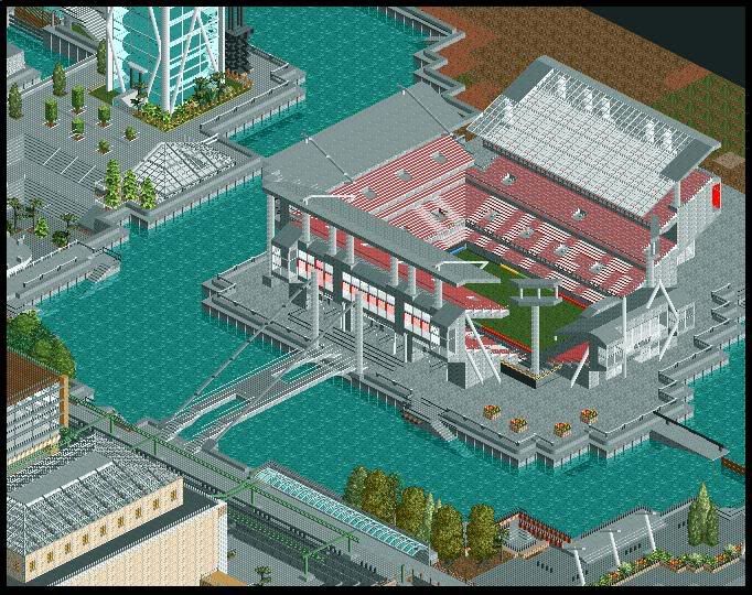
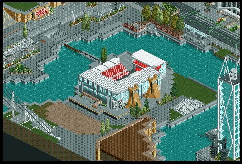
Without further ado - Dockland Park Stadium v2:
FootballStadiumv23.jpg


Another View, with river:
FootballStadiumv22.jpg


From afar:
FootballStadiumv2.jpg


A thriving Docklands:
FootballStadiumv24.jpg


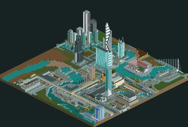
The Map so far:
AsaWhole2008-01-23.jpg


---------------

Comments appreciated,

Coaster_Monkey
 
Whoa, whoa, whoa, whoa, whoa.

I said it was realistic before, but this is just like, totally realistic. It resembles every stadium I've seen down to a tee really, so good job with that! I like the way you've taken everyone's advice, and then went back to it to making it even better!

I'm very impressed dude, this is one of my favourite buildings in your city thing.
 
I must say that it's quiet sexy..Infact the whole thing is...Really does put shame to other people on the boards. Go find another board to post your work, your like..too good for here :D.


BTW, I own the big black building for my mega muli-million pound company..

Good work keep it up....
 
LFTL - Ha! Thanks a lot!
Yea, the old design was alright but I do believe this is a massive improvement. I'm trying to fit in all kind of styles of stadiums within this one - it's quite hard to pull off but I'm making progress.
Yea, everyone helped me a lot - I don't just ask for comments and just dash 'em away, everything you guys say really registers within me and thus helping me improve. So thanks.

To be honest, I'm starting to also think this is the best building I have in my city (thing).

Cedar_Dude - Sexy? Well..... :oops:
I'm not here to put people to shame but am here to show that RCT can be pushed and people should juts give it a go.
Too good? I wouldn't go that far, but I really appreciated it mate! :--D
(The 'Dockland Point' skyscraper is now yours)

-------------

Just a quick update....
Steady progress, stadium is now 75% complete:

FootballStadiumv26small.jpg


FootballStadiumv25.jpg


AsaWhole2008-01-24.jpg


If you closely look I've named the Football Club that owns this stadium, Ilford United (ha!).

--------------

Comments, as always, appreciated.

Coaster_Monkey
 
Much, much, much, much, much better.

But where's the towers? :( Best part of the building :p
I think that the red needs to be the dark red. It would make the building stand out more.

Loving it though, so great.
 
Pineapple: ha! Yea, I tried with the towers, just seemed a bit too tacky for me. I miss 'em too but.....c'mon! :lol:
I don't understand about the 'red' business - I am using the 'dark red', if you're on about the old colour scheme then, I have nothing to say. I thought it was too bright - I know most of the Map is a bit bright but I kinda like the worn look the seats have.......
*shrugs* I am to please, but sometimes I can't be pushed/(asked) ;)

-----------

Small update - Big news:

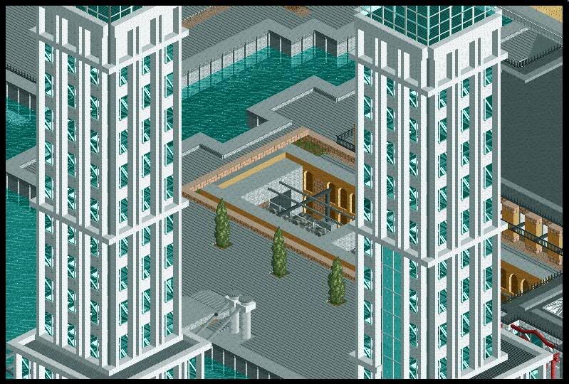
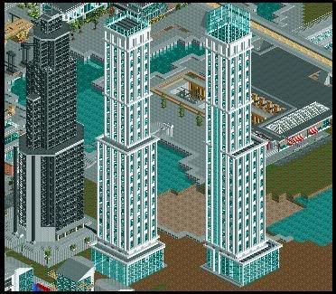
I welcome you to Docklands newest arrivals - 'The Perl Towers'.
The tallest building on the map and by far, imo, the best to date.

There won't be a big picture update as the area is far, FAR, from finished - so please bare with what I've got.
It took me three and a half days to finish the towers and they've come out just how I wanted them to - so I've finally got a perfect, reiterate - IMO, tower in my park.

Also, the Stadium is nearly complete - the surroundings bothering me as I'm stumped for ideas....But I'll get there.

----------------

On top of the towers - a viewing unit has been built for guests to reach the highest point of Docklands:
TheWhiteTowersCloseUp.jpg


Old meets new:
TheWhiteTowers.jpg


----------------

Getting there:
IlfordStadium2.jpg


.....Notice the bridge?
IlfordStadium.jpg


----------------

In other news:
One area of the Map will be completely transformed into a market - a lot is planned and a lot of changes are heading Docklands way.
So watch this space......

Comments, as always, appreciated.

Thanks,

Coaster_Monkey
 
Wow, this is so good, and so original to everything else.

I like the new towers, they look really cool and modern, so does the stadium. The bridge to the stadium is really nice too.

UncleArly
 
Lol, what can I say that I haven't said before?

As usual your work doesn't fail to please. The buildings are great and definitely stay true to modern architecture. Everything looks fabulous with the stadium too, though I'm not understanding why there are stairs going down into the water.

Keep it up, love it! <3
 
Top