What's new

MARCH 15th- UPDATE!

Yes very, nice but maybe i think there is too much gold in the buildings so maybe turn it down a bit.

Other than that just don't take picture in the rain!

And is this park going to have peeps?
 
^ Do you mean brown? Because I haven't used the gold colour very much; it could be the rain that is making it look that shade though, I dunno.

And no, it's not a peep friendly park.
 
I think you should make the monorail a grey or something as it blends in way too much the way it is now.
And if that is a high dive show in that little lake I suggest adding a couple more sqaures to the lake as it is very small how it is now.

You are getting really good though, please keep going with this park.
 
I think you should make the monorail a grey or something as it blends in way too much the way it is now.
And if that is a high dive show in that little lake I suggest adding a couple more sqaures to the lake as it is very small how it is now.

Yeah, the monorail is just kinda sitting there right now so I know which areas to avoid with buildings and stuff; I haven't really done the colours or anything yet, and the layout of it isn't exactly final either.

As for the diving show, I was thinking the same thing.

just joking, but i like peep friendly parks.
Me too, but since I made a whole shopping centre and stuff, the peeps kinda got bored really fast and my park closed. I just want to get better and making parks first, and then maybe I will consider making one peep friendly.

Thanks for the comments!
 
You've come a loooooooooooooooooooooooooooong way Tay. That's very very good. Try to take your pictures when its not raining though. It can hard to make comments on colour schemes and whatnot when it's darker.

If there's one thing I do not like in this so far it is the Monorail. The colours are bad (although that has been commented on already) and I have this thing where I believe Monorails should always be on the one elevation and never go up or down. Mainly because Monorails lose a lot of steam when they go up even the smallest of hills and it just doesn't look great to me. Because of that I find that Monorails can be tricky to put in. Other than that excellent. Post some pictures during the day so I can maybe comment on the colours.
 
Thanks Claw, I like to hear that people think I have improved!

As for the monorail, like I said, I just put it there to give people an idea of what the station is like, and to give myself an idea of what areas to keep buildings away from at the moment, that way the monorail doesn't like, run into the buildings. I'll end up fixing it up when the whole area is done (the colour of it is grey now though, I just haven't posted any screens).
 
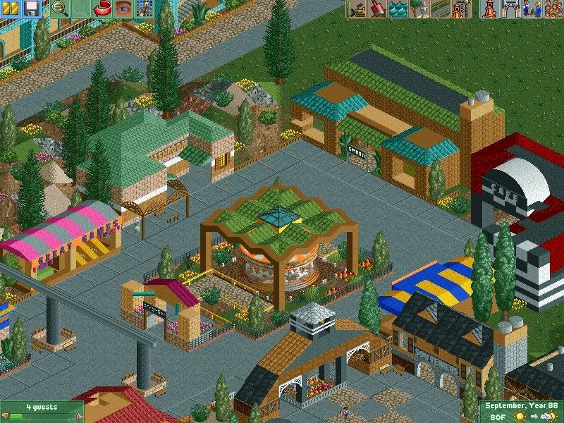
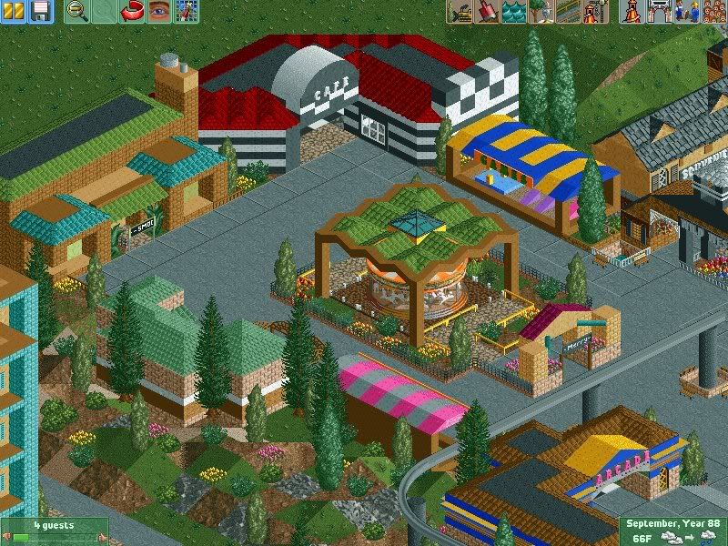
The screens look really good! The only thing that bothers me is the Golden Roofs. I think they stand out too much.

Sorry, everything else is great though. The buildings themselves are really good! :)
 
Don't worry guys, I have been working on it, just not really enough to warrant a big update. I made a midway and a carousel and a few new buildings, but I'm having trouble making an actual park layout and a lot of things that I have built, I have demolished in the same playing session.
 
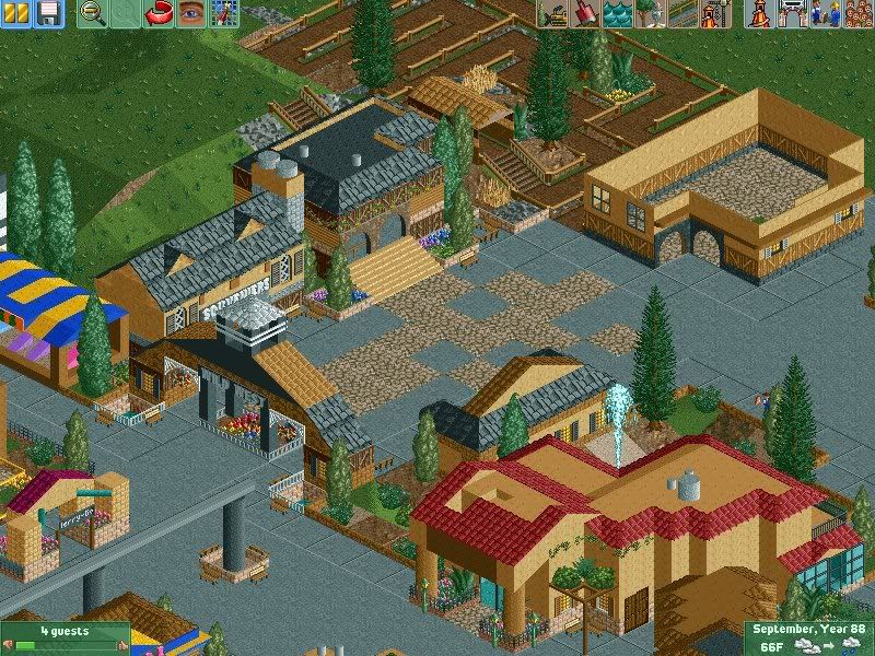
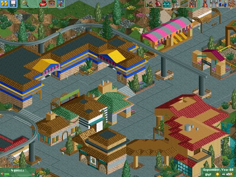
Alright, well, I figured it's time to update this despite it being kind of a small update, because all I have been doing is building and tearing down. But, it's time to show, I suppose.

SCR15-3.jpg


SCR16-4.jpg


SCR17-3.jpg


SCR18-3.jpg


(Obviously the Wild West section isn't quite complete yet, but you can see a queue line and an unfinished building where a coaster is going to be)
 
Don't bump old topics ;)

It looks good (but mysteriously dark, somehow), and I like the looks of it. However, it seems to lack an atmosphere, but I guess that will come sooner or later. The arcade looks great, and the coaster area looks promising.

Can't wait to see more.
 
I really like the roof thing over the carosel and the arcway leading into the Wild West section. The games stalls are really well done aswell! The terrain in the 3rd screen looks really neat too. :p

The que line is great too.
 
It looks good (but mysteriously dark, somehow), and I like the looks of it. However, it seems to lack an atmosphere, but I guess that will come sooner or later. The arcade looks great, and the coaster area looks promising.

It does lack atmosphere and it does lack a bit of colour, but I plan on adding in a lot more, especially in the Wild West section which I just added today. So, expect some small improvements to be made here and there :p .

I really like the roof thing over the carosel and the arcway leading into the Wild West section. The games stalls are really well done aswell! The terrain in the 3rd screen looks really neat too.

Thanks Deano!

Also, I'm gonna add in more flat rides and such since I only have like, one ride and a piece of a monorail so far.

The thing I am having trouble with is getting a good layout for my park.
 
Top