What's new

Most impressive Coaster Designs

Fluorineer

Mega Poster
What are some coaster layouts that truly impress you not necessarily because of the ride experience, but because of the blatant brilliance of the design itself? What makes a brilliant coaster design, and what are some design accomplishments that easily go overlooked or are overshadowed by aspects of the actual ride experience?

A coaster design that will always have a special place in my heart is Goliath at Six Flags Great America

It takes an enourmously ambitious engineer to think of putting in a 50m tall Wooden Coaster into the footprint the ride occupies, considering all Wooden Coasters of similar height are absolute behemoths that take up a good chunk of prime real estate in their respective parks.

I don't think I need to say much about the support structure, it's just incredible. This coaster could easily have looked ridiculous and obstructed by a mountain of wood (just imagine the support structure of the dive loop, except it's everywhere), instead it's both a display of engineering marvel as well as it's prime elements.

Talking about elements, the choice is absoultely perfect. Not a single meter of track is wasted. While a top speed of 115 kph eliminates all pacing problems one could have had entirely, it makes it significantly harder to size the elements appropiately within the tight footprint. It hits the perfect mixture of standard wooden coaster elements like the first drop, tunnels, turnarounds and airtime hill, appropiately turns them up to 11 and combines it with ridiculous inversions never seen on a Wooden Coaster before, which are not only fit accordingly to the ride experience, but also to the ride engineering - the Dive Loop is necessary to avoid a 3rd tight turnaround, and the Zero-G-Stall is the heart and soul of the support structure.

While complaints about the short ride duration are valid, this is a byproduct of the unusually high top speed, and a track length of 945m is nothing to scoff at. Also, I must say that I'm a big fan of RMC's general approach: if there is a way we can make it that high, that steep and that fast, there is no reason we shouldn't. It makes you wonder what other compact (wooden) coasters could have packed significantely more of a punch if the ride designers didn't autopilot towards lower heights just because the footprint is small.

And as a nice cherry on top, the layout is reminiscient of the classic Cyclone layout. It is also not a contraption press fit into the specific circumstances at Great America, but instead easily cloneable. I suppose it is unfortunate that most other Six Flags park had a bad wooden coaster they rather converted than building a new Topper Track, and the Raptor has become more attractive to smaller parks who are looking to plop in a ridiculous and compact thrill coaster, but it's not hard to imagine circumstances in which Goliath-clones plop up all over the US.

tl;dr: Alan Schilke is truly my favourite crackhead :p
 
Great thread idea @Fluorineer!

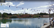
In terms of some rides that really impress me from a design and logistical perspective, one that comes to mind out of rides being built right now is Monster at Gröna Lund. Looking at Gröna Lund even pre-Monster, the park was hugely ride-dense, and space looked extremely limited for any kind of new attraction to be installed, let alone a huge inverted coaster. Yet even with their obscene space constraints working against them, Gröna Lund pulled out all the stops to fit in a fairly substantial B&M inverted roller coaster. Most park designers would look at the space where Monster has been built and say an instant “no way” to building any kind of ride there, yet Gröna Lund persisted, and used every possible technique to fit the ride in! For starters, they literally built the station underground, which is nothing short of obscene in itself! They had to lower the trains onto the transfer track by removing the floor of a restaurant and placing the maintenance area beneath there! The ride’s layout takes place almost entirely over public walkways, that are adorned with buildings, facilities and other rides! I personally find the way that B&M and Gröna Lund overcame the adversity of the space utterly mind-blowing, and no matter how popular the actual ride is, I’ll always find that truly inspiring about Monster’s build!

I must admit that even though I’m not a huge fan of the actual ride experience itself, The Smiler at Alton Towers also really impresses me from a technical standpoint. Alton Towers and Gerstlauer managed to cram 14 inversions and almost 4,000ft of track into a plot of land previously occupied by a fairly small Schwarzkopf family coaster, and a plot roughly equivalent in size to that of your average Vekoma Boomerang. The ride was said by John Wardley during its development to be the most “track-dense” (largest amount of track per unit area) roller coaster in the world, and I can’t say I’m surprised! Multi-inversion coasters with the amount of action that The Smiler has usually take up huge, swathing plots of land, yet somehow Gerstlauer and Alton Towers managed to cram that action into a hugely compact package! Also, I’m also a huge fan of The Smiler’s base layout; for a roller coaster with 14 inversions, I think it’s hugely creative, and doesn’t ever feel repetitive or boring! There’s a very wide range of elements and sensations packed into The Smiler’s layout, and even two excellent bursts of ejector airtime to complement the plethora of inversions! Overall, even though the roughness means that Smiler is not my personal cup of tea, I do really admire the ride from a technical standpoint, and I think the way that so much was packed into that tiny space is genuinely inspiring!
 
I'm going to re-post my old gushing about the genius use of land for Ice Breaker at Sea World Orlando:

[start quote]
I really like it. Swing launch, some thrilling turns, and no inversions. Great little stepping stone coaster between kiddie rides and the big, tall, upside-downey coasters.

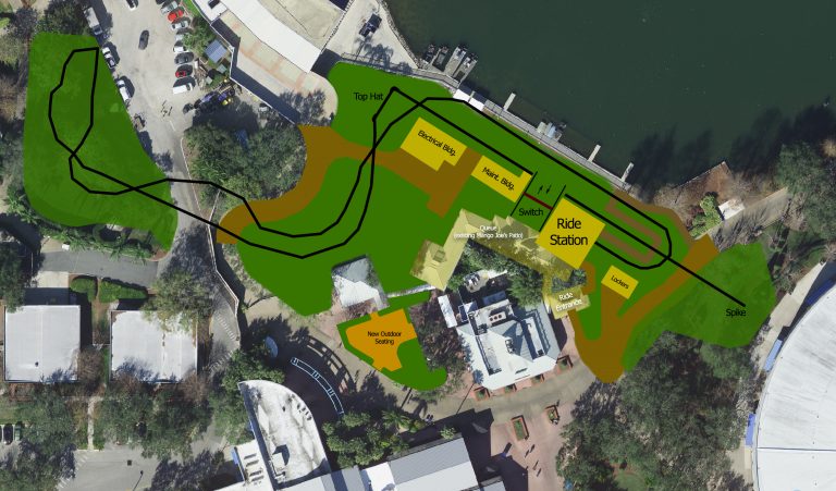
However, there's another reason why I'm actually impressed by it. Please allow me to geek out a little: I really appreciate how they solved the challenges of the building site, which I presume is why the coaster didn't at all turn out like Wave Breaker. This picture from The Coaster Kings (source) shows what they had to build on:
PlanOverlay_Draw_FULL-1-768x451.jpg


Put simply, the available land is really cramped, and split by the Bayside Stadium's access road to boot. The coaster has to cross that access road somehow to utilize the bit of land on the other side. Moving any buildings (the stadium at the very top, some big buildings just outside the picture's left edge, and the Mango Joe's eatery) or the access road itself would be prohibitively expensive. Presumably, so would building in the lake be, either because footers in water are a hassle or because the activities at the stadium requires the space (a lot of the lake around Wave Breaker at San Antonio is fenced off with a pretty wide clearance around the track). So all in all, the site is fairly constrained. Additionally, the ride's station needs to be close to the existing paths, which effectively means on the very right side of the plot since the coaster wouldn't fit around it if it was placed left of Mango Joe's.

A conventional launch like Wave Breaker's requires a fairly long straight piece of track, and at some point the track has to turn too, so we're talking a J shape around 80-100 meters long and a 30-ish meters wide, with more track attached at either end. That would have to fit on this land somehow, without touching any of the buildings. And the land on the left is not really big enough to house a post-launch turnaround, so something would have to be done to bleed some speed before getting there.

A swing launch is an elegant solution, since it can cram a pretty fast launch into a tiny area by launching over the same piece of track multiple times. Moreover, with a vertical spike you only have to have a turn at one end of the launch track. The rear of it can just stick out wherever (in this case, a tower structure on the other side of the path). Squeezing in that launch track AND a post-launch direction change (in the form of a top hat) on the land by the lake shore is pretty neat, I'd say. The layout gets the train up to top speed and pivots it into another direction, all in the 80-by-20 meter plot between the path, the lake and the stadium. Then they manage to put a turnaround on the little site at the other side of the access road without having to put a single footer in the parking lot (Wave Breaker's flat turns are semicircles around 25-30 meters wide - they could fit on the land, but either the entrance or the exit of the turn would have to go over the parking lot and require footers in the middle of it), and from there on the layout returns to the station with a minimum of faff. They even avoid touching the cluster of trees next to the parking lot.

For an avid fan of games like RCT and Parkitect, this is a very neat example of coaster architecture. The designers fit a pretty decent layout on a challenging bit of land. Yes, something like Wave Breaker would have been cool too, but it's big and sprawling and the available site just isn't. Instead, Premier and SeaWorld have worked with what they have, and even if the coaster ends up poorly executed, the concept itself is pretty solid. In a sense, it reminds me of Taron, which is another coaster squeezed into an impressively tight space for its size. So yeah, it gets my sign of approval.

[end quote]
 
Monster and The Smiler are two really good shouts.
Two more examples that spring to mind, both of which are in Sweden funnily enough, are Helix and Wildfire. Like, I don't even know how they got heavy machinery and lifting equipment in those tight, hilly spaces to install the thing.

Taking that argument to its extreme, what about Glenwood Caverns? In bad weather you can barely get people up to the top of that mountain, let alone a roller coaster, even a fairly small one. And although it isn't a coaster, there's also the Haunted Mine Drop. They blasted a 120ft vertical shaft into solid rock... and then put a drop tower in it, all on the peak of a 7000ft mountain!
Mind boggling.
 
I've always been thoroughly impressed with The Voyage's layout. Managing to build a 6,442 foot-long coaster with only a single 159-foot tall lift hill and a drop height of just over 150 feet- nearly as long as the likes of gigas such as Millennium Force & Fury 325, having track lengths just a few hundred feet more - without ANY other means of propulsion is truly no small feat. Even The Beast has a second lift hill and a drawn-out pre-lift section, but even with those, it's still under a thousand feet longer than Voyage.

Whereas I agree that Ice Breaker, Monster, The Smiler and Boardwalk Bullet are great examples of coasters that make brilliant use of their tight (or awkward) footprints, Voyage makes incredible usage of the uphill terrain to use up every last bit of its momentum for a monstrously long ride. I'm always amazed at how Voyage manages to keep a rampant pace across said ride time, staying low to the ground after the first few hills and only having a single dead spot (the mid-course brake run), with floater (and ejector) airtime and laterals aplenty.
 
I'm gonna have to mention Icon, there's nothing quite like it when it comes to weaving around other rides and pathways, it's truly an impressive coaster design, even if it's not the most thrilling. On a side note, I have seen the supposed Vekoma layout of what Icon could have been and it's absolutely a wasted opportunity.

I'm also surprised nobody has mentioned Nemesis, I mean isn't that the OG when it comes to impressive coaster design? Literally built in and around a man-made trench, there was nothing like it at all at the time and it is still highly regarded by many.
 
Surprised Taron and FLY haven't been mentioned more in this thread; Taron particularly. I guess it's because they're well received rides anyways.

Klugheim is a huge area, yes, but having that huge ride intertwine through itself, plus the area, plus another ride, is impressive. I haven't done FLY, but it's a similar set up I'm sure.

RMC conversions in general are impressive too tbf. Taking older rides. many of which weren't that well received, and turning them into something which the majority of people adore is a hugely impressive piece of coaster design.

I'd also chuck in the S&S El Locos, simply for the fact that they pack a nice variety of elements in a very small space. Ride experience is meh, but I'd say the execution is good.
 
I like Great Bear at Hersheypark for the same reason as Monster; squeezing a B&M into a space where there really shouldn’t be a B&M. Especially because they weren’t allowed to put footers in the water, that puts up some crazy engineering challenges, but they pulled it off!
 
I want to give a cursed honorary mention to the SLC.

People tend to point out its janky transitions in a similar fashion that they would be pointed out on an Arrow Looper or a Togo Coaster, but honestly, I don't see any element within the layout that doesn't fall victim purely to its inappropiate track design. Like, yes, I understand that the overbank between the Roll-Over and the Sidewinder feels wrong, but that's just because the track doesn't allow for these kind of shenanigans. In a twisted way, the SLC was ahead of its time.

If you were to replace the Vekoma-track with B&M-track while leaving the profiling exactly as is, you would get a perfectly fine Invert. The inversions are unique (ironically), the pacing is great, the footchoppers are a neat feature and overall, it's an ingenious layout for the small footprint.

The biggest problem for the SLC is not necessarily the fact that the B&M invert exists, but rather that Batman the Ride exists, which is a better clone-layout in every way imaginable and even occupies exactly the same amount of square footage. I don't agree with too many of Taylor's ride reviews, but what he has to say about Batman is absolutely spot on, and it becomes especially bad once you factor in that this ride debuted in the same year that the SLC did, which is why Batman also deserves a mention in this thread, albeit a genuine one and not a cursed one :p
See, I’m actually a big fan of the physical SLC layout itself, as far as inverts go! There’s a nice, wide variety of inversions, the rides keep their pace fairly well, and they pack a lot into a tight space!

It’s just that they often tend to be so, so unbelievably rough (or at least, Infusion, the one SLC I’ve ridden is), and that means I just can’t enjoy it at all.

My biggest gripe with SLCs his how they tend to water down the coaster collection of parks that reasonably could have gone another way.

Infusion at Blackpool looks fine and is well integrated with some nice water features. For a park that notoriously has no space and no money, it would be silly to start the "but what if they got a B&M Invert"-game. Just put vest restraints on and you've got yourself a fine multilooper - just like Walibi Holland is doing right now, another park for which a B&M-Invert would have never been in the cards back in 1994.

But look at Heide Park for example. Considering how much money was flowing around during the 2000s with Colossos and the rumoured Giga coaster, it's just a shame that they went for an SLC in 1999 - not only is Colossos well underway in 1999, but also the B&M Invert has been established on the market way too well. The SLC is just flatout inappropiate there. Just think how good their coaster collection could have turned out and how "easily" they could have aimed for the undisputed No. 1 coaster collection in Germany.

Fast forward 22 years later, and despite having gotten two half-decent B&Ms in the meantime, every coaster in that park feels like filler for Colossos. To put insult to injury, they have made the same mistake two more times: correctly assessing what ride would fit the park well, but then going with inappropiate ride hardware. Desert Race is just flat-out bad across the board, and Krake luckily has been salvaged by it's theming, yet still isn't worth queueing for longer than 10 minutes.
 
The three 4D coasters. (X2, Eekinaika, Dinoconda)
SV / Lrod
Every Raptor
Voyage / Boardwalk Bullet / Switchback
Mr Freeze Reverse Blast
Time Traveler
And of course, every Air Grover / wacky worm 🐛
 
I'm going to re-post my old gushing about the genius use of land for Ice Breaker at Sea World Orlando:

...

For an avid fan of games like RCT and Parkitect, this is a very neat example of coaster architecture. The designers fit a pretty decent layout on a challenging bit of land. Yes, something like Wave Breaker would have been cool too, but it's big and sprawling and the available site just isn't. Instead, Premier and SeaWorld have worked with what they have, and even if the coaster ends up poorly executed, the concept itself is pretty solid. In a sense, it reminds me of Taron, which is another coaster squeezed into an impressively tight space for its size. So yeah, it gets my sign of approval.

[end quote]
I assume you know that it was genuinely designed by our boy CP6 of rct fame? He even had it built in his ongoing seaworld park before it was announced but couldn't show screens on nedesigns lol

In terms of design, I don't know if Black Mamba can ever be beat. To me, its almost perfect. But I've gushed about it before. I also would shout out BTMR- a brilliantly long layout in a surprisingly small space which has a very satisfying narrative structure. But what's a more surprising pick? Maybe the somewhat underrated Hollywood Dream-- I think it packs an incredible punch for its size and squeezes its way through the park brilliantly. A million times better that rip ride recycle reuse and reduce. I also think the vague "pinfari/galaxy/zyklon/whatever" sort of pseudo-figure eight sprawl is actually a damn fun ride design. Clearly so, based on its popularity.
 
I can't help being a little impressed by the common Vekoma Boomerang. After all, they are six-inversion coasters on a very small footprint, and they are cheap enough that tiny parks in the middle of nowhere could afford one. They have some issues with rattling and smoothness, but that's down to design and manufacturing issues, not due to anything wrong with the concept.

Come to think of it, tt's kind of odd that we haven't seen any Boomerangs with Vekoma's new track style. One would think the aforementioned issues would be vastly reduced by the design/manufacturing innovations that have happened since the 1990's.
Just 'cos I can never pass up the opportunity to bash them - my personal issue with Boomerang's isn't the roughness, it's the backwards. Those are some intense inversions to take backwards, and there's something about it that completely throws me off. I actually don't mind them forwards, but the reverse part is hell.

So yeah - even making them out of fancy new track and giving them fancy new trains wouldn't help their reputation for me. Still god awful.

- - - - -

To be on topic, and just to throw some other thoughts into the mix here (I agree with many of the coasters named so far) - I'd also give a shout-out to Thunder Dolphin for a pretty epic bit of coaster design. Integrating a huge coaster into a building (and a small plot) like that is no mean feat.
 
Last edited:
A couple stabs of thoughts:

  • Gatekeeper, Cedar Point - Yeah I know, CP fangirling here. But comeonnn; it completely revamped a cramped and expansive park entrance to an open, easy focal point. The entire corner of the park has had a huge quality of life improvement from the old Disaster Transport days.
  • Banshee, Kings Island - I am a huge sucker for any roller coasters that take advantage of topography. Even though Kings Island is far from any semblance of hills (like the rest of Ohio), I've always loved the design of Banshee to take advantage of the oh-so-subtle, but definitely there ravine at the back half of the coaster - to the extent of the ride's top speed is actually achieved at the bottom of the Pretzel Loop. Just an impressive design of engineering, especially when B&M Inverts can be so turn key.
  • Goliath, SFoG - Always loved the clever land-use on this one -with a minimal in-park footprint, and bulk of the ride layout outside immediate park boundary. A pleasing visual coaster, also built with a lot of intent to minimize internal footprint. There's a number of good B&M hyper examples akin to this in turn; I just like Goliath's ultimate execution.
  • Hydra the Revenge, Dorney - It's a small but mighty (as long as you ride back row) coaster that packs 7 inversions into a 105 ft. drop - quite impressive when you consider it only has a top speed of 53 mph (for comparison, Hulk also has a 105 ft. drop, but reaches a higher top speed of 67). Like Banshee, a part of the secret sauce is taking advantage of a slope in the layout that produces a very funky Cobra Roll inversion. Not a coaster to write home about, but hats off for packing a lot in.
 
Top