FORUMS - COASTERFORCE
You are using an out of date browser. It may not display this or other websites correctly.
You should upgrade or use an alternative browser.
You should upgrade or use an alternative browser.
Phantasialand | F. L. Y. | Vekoma Launched Flying Coaster | 2020
- Thread starter roomraider
- Start date
CSLKennyNI
Giga Poster
Some more views of our favourite wall.


Markings are being added to the curved dome bit - whatever will be added next?

Source


Markings are being added to the curved dome bit - whatever will be added next?

Source
Crazycoaster
Giga Poster
I seem to remember seeing that exact logo months ago when they first announced the name FLY?
JoshC.
Strata Poster
I get the idea for the logo - I believe it was pointed out it resembles badges that pilots receive? - and the wings give a subtle nod to Phantasialand's love of dragons. And in it's own right it's cool. But with everything else we've seen, it doesn't seem to quite fit?
Maybe as Lofty says it'll feel more natural in context. But for now, the jury is still out.
Maybe as Lofty says it'll feel more natural in context. But for now, the jury is still out.
CSLKennyNI
Giga Poster
Yeah the logo has been around and used in park imagery for well over a year. Definitely supposed to be a pilot's badge. Fitting with the hotel being a home for Aeronauts theme and all.


Is it just my perception of the lighting or does it possibly look like there might be changes happening to the door in the entrance archway?
Dar
Hyper Poster
It looks like there's something going on, the doors seem set further back from the front in that new shot. I can't see the separator between the doors and the top either, but they could both by a trick of the light.
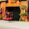
I wonder if the top could be getting an arch over top, instead of chimneys like we assume?

I wonder if the top could be getting an arch over top, instead of chimneys like we assume?
CSLKennyNI
Giga Poster
New frames for signage or screens at the Berliner Street Rookburgh gateway.
The possible lighting tests last night.

The possible lighting tests last night.

Last edited:
CSLKennyNI
Giga Poster
From Yanninator on PhantaFriends.de another look at the frames for new info/waiting times screens at the Rookburgh gateway.
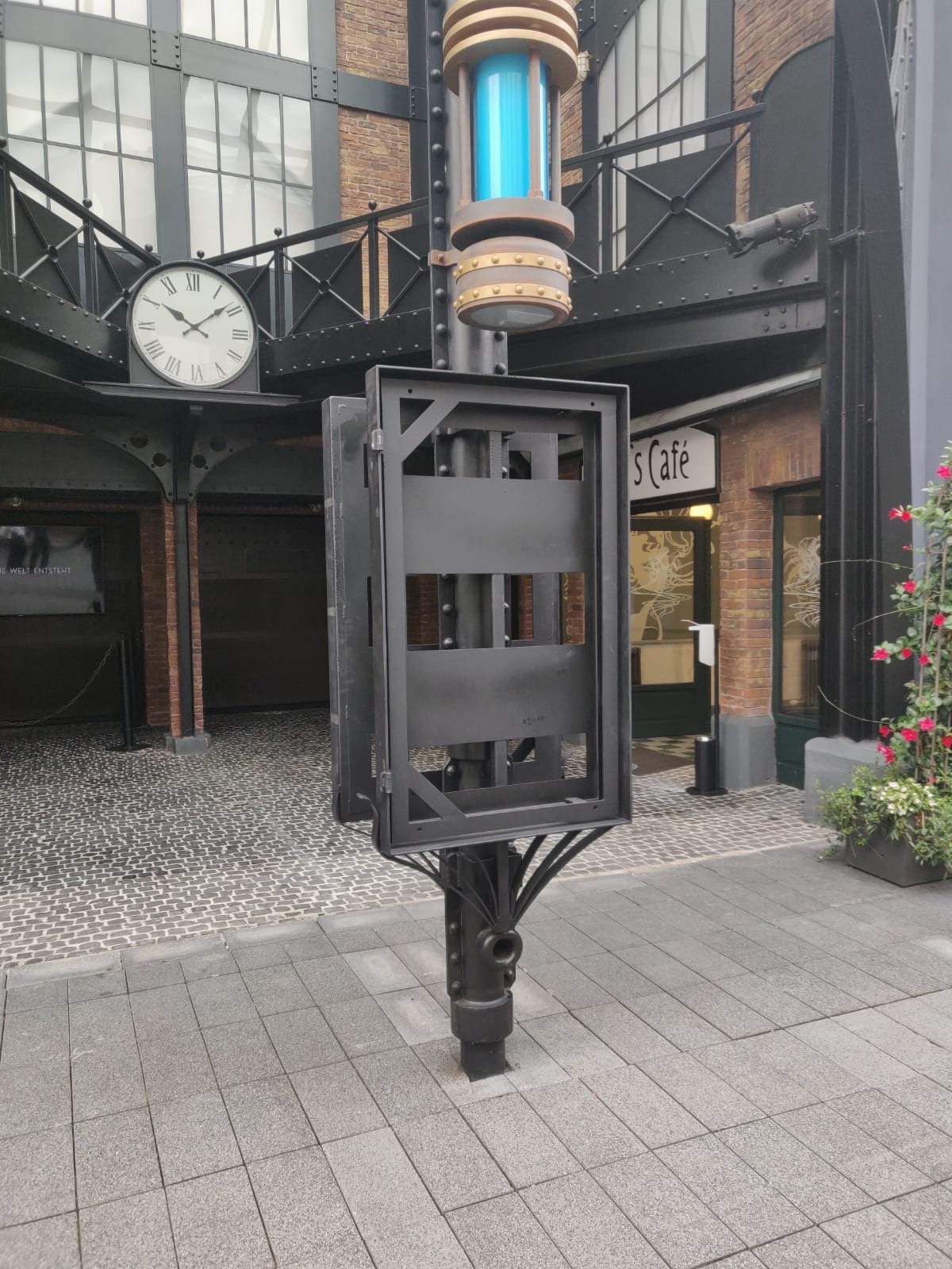
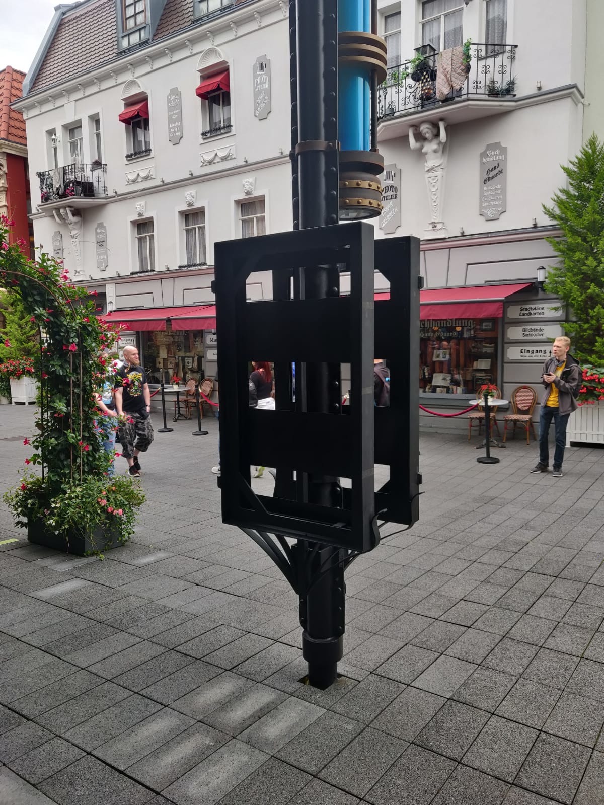
Intriguingly the tape and distancing markers stuck down inside the right side of the gateway for Lilli's Cafe have been removed/cleared away - freeing up the space for entry to Rookburgh...


Intriguingly the tape and distancing markers stuck down inside the right side of the gateway for Lilli's Cafe have been removed/cleared away - freeing up the space for entry to Rookburgh...


