What's new

Theme Park Maps

Matthew Fair

Mega Poster
I was recently planning a few theme park trips and this got me thinking about the variation in quality of theme park map quality. Some maps are amazing and really clear to use whereas others look awful and are practically useless.
GREAT TIER- Magic Kingdom, Islands Of Adventure. These maps are to scale and use realistic drawings of the park making navigation easy. They also look very professional and polished.
1565859897155.png1565859997467.png
GOOD TIER- Flamingo Land, Blackpool Pleasure Beach. These maps are still easy to read but the visual style could be improved somewhat.
1565860078595.png1565860129292.png
BAD TIER- Alton Towers, Thorpe Park. The cartoony style makes it a nightmare to read and understand rendering the map almost useless.
1565860201379.png1565860234394.png
So what do you think? What are the worst/ best theme park maps you have ever seen?
 

Attachments

  • 1565859948617.png
    1565859948617.png
    223.4 KB · Views: 14
Nice thread idea. I think the recipe for a clear map is a good ratio between how much focus there is on paths to how much focus there is on ride drawings. The Towers one is fun to look at but it would stress me out trying to navigate from it.
 
Actually studied this before (whilst studying 'travel' I took the opportunity to slightly rebrand and polish Hansa Park's stuff, including their website and map, albeit at a 17 year old, amateur, new to photoshop level).
A good map is one that, as stated, has clear paths and shows you where the attractions are and how to get to them as a priority; everything else should come second.

Blackpool's & Disney's maps are the only maps with any sense of 'scale' or truthful correctness out of the examples. Blackpool's is an Isometric piece, and Disney's is a plan (albeit with some augmented perspective put in it).

Thorpe's map doesn't need to be particularly good, the park is largely easily navigable and the exaggeration of each ride makes it clear of the rough location of easily identifiable landmark points. Trouble is, things like the sunken gardens and the swarm apparently being reachable from stealth have always been an issue. (the map on the app is so much nicer oml). Towers is tricky as it's such a difficult piece of land to plot. Emphasis should be on the theme park, but it sprawls so intensely and the gardens are also colossal. Things like this vary between every single park in the world, so whilst one format may work really well for one park, it may be terrible for another.

I went through a period of collecting maps because I was so fed up with how tacky a lot of the merch and memorabilia is at theme parks. Chucked them all out recently though. Personally think that the likes of Europa, Toverland and Efteling have got it about right. Easy to use, look nice, and show you a little bit of what the attractions might be like without going all over the page in your face.

tl;dr Ultimately maps are a tool to help you get around. Even if they're the prettiest, coolest looking thing you've ever seen in the world, if they can't help you get about, they've failed their only purpose.
 
Last edited:
Park maps do my box in. This insistance on having a 3D view with drawings of all the attractions sometimes means that it's literally impossible to tell where pathways lead, which should be the whole point of having a map in the first place. Another obvious requirement is to let you know where the entrances to the attractions are, which many park maps don't even try to bother indicating.

I don't know why you'd call the Blackpool map "Good Tier". I was there a couple of weeks back and the map was all but useless. The rides are all listed with a grid reference but the reference lines are practically invisible, so all you get is a vague idea of the general sort of area to head for. I'd challenge anyone to figure out how to get to the entrances to Icon or The Big One just by looking at the map, for instance.

I can understand why the parks do it but I'd much prefer a standard 2D overhead map with the attractions numbered. That Magic Kingdom one looks ideal.
 
Once you’ve conquered Phantasialand’s map... Nothing stands in your way!

Don’t see what is wrong with the AT map, looks perfectly clear and makes sense to me, all of the main paths and rides are in the right places. You’re being too harsh, it’s a HUGE park!
 
Seriously the alton towers map is a mess, they need to loose the resort side on the park map. Have the resort on the back or something. Yes the park is big but the maps were so much better in 1996-2002.
You could make much more sense of them.
 
Seriously the alton towers map is a mess, they need to loose the resort side on the park map. Have the resort on the back or something. Yes the park is big but the maps were so much better in 1996-2002.
You could make much more sense of them.
The Hotels have been on there as far back as 97... in 98 through 2001 they had huge images taking up real estate in every corner. The paths on those maps were not realistic in scale or route, in fact some of the shorter routes were missing altogether from some maps (the log flume shortcut to haunted house / duel)

The worst Alton Towers maps by far were 06 / 07 era... These newer maps are at least a far remove from them, and much closer to the classic maps than those too.
 
May I present you all with one of the most stylistically pleasing, yet functionally abysmal park maps:

sXgBBqZ.jpg
 
GREAT TIER- Magic Kingdom, Islands Of Adventure. These maps are to scale and use realistic drawings of the park making navigation easy. They also look very professional and polished.
View attachment 5881

Compared to the ones they had a few years ago, the new ones look a little bland to me tbh. I adored the detail and angles they put into their previous style.

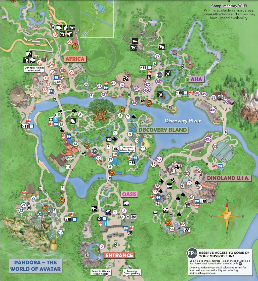
Like compare AK's old map:

Maps_Full_9747.jpg


with the current one:

DwVcJxsWoAMiO9a.jpg


The current one may be more accurate to scale (?), but everything is a lot more spread out and the colors are way less saturated. It just looks a lot less interesting to the eye.
 
I like both of Disney's map styles. The previous design has a lot of character and detail but I like that the newer maps are designed to look more accurate to match the maps in the phone app.

IMO a good park map has a good amount of detail and is easy to read so you can actually use it to navigate the park. Good examples of that are the current Six Flags maps and the newer, less cartoony Cedar Fair maps. Some parks try to put too much style in their maps so they're hard to use but some maps are strictly functional so they look boring (like the older style CF maps or Merlin's park maps).

I'm a total sucker for old school, hand drawn park maps. Those are some of my favorites because they're practically works of art, but they perform a function pretty well.
 
May I present you all with one of the most stylistically pleasing, yet functionally abysmal park maps:
I can just imagine how that one came to be:

Mid off-season, meeting between graphic designer and park officials:
Park: So, how's the work with the new map going along?
Designer: Fairly good! I think I've settled for a style, and I've drawn up most of the assets. What we have here is a little picture of all the buildings and attractions, sorted roughly according to their placement in the park. Now we just need to put them into the map background and assemble the final map. Should take another couple of weeks...
Park: Nah, this is good. Here's your payment. Hey, intern, send this thing to print!
 
I think a map should look interesting for themepark.
As long as the connecting routes between different sections looks correct and the reference points are clear, a map is good enough for me.

With this I mean that if I want to go from A to B, I should be able to see behind which attraction I have to take the path, and for which attraction I have to aim. Scale is therefore irrelevant to me.
 
Top