What's new

Thorpe Park | Hyperia | Mack Hyper Coaster | 2024

My first ride of the day on the 18th will definitely be SAW for these epic views! (assuming that the lovable temperamental thing isn't down...)

(edit: My first ride of 2023 was indeed SAW and the views were very intriguing ...
 
Last edited:
I'm surprised Slammer wasn't removed during the closed season during this clearing to minimise work needed in the operational area of the park. Saying that, was it confirmed to be removed as part of this?
 
Would make sense that Slammer is removed next closed season before Exodus opens just to tidy up that part of the park especially as that will be a VERY busy corner from 2024 onwards.

Once Exodus (THE Intimidator) is open I reckon that we’ll see a lot of changes in the park going forward in terms of tidying up the old run down areas & then investing in new. I’m very optimistic for Thorpe’s future.

It’s definitely exciting now Old Town has pretty much been cleared and hopefully we’ll be starting to see vertical construction sooner rather than later but my impatient side is taking over & want to see it happening NOW.
 
Last edited:
I'm surprised Slammer wasn't removed during the closed season during this clearing to minimise work needed in the operational area of the park. Saying that, was it confirmed to be removed as part of this?

It was mentioned during the consultations that they were looking at the Slammer site and what to do with it. There was also some vague "watch this space" style comment, but no confirmation it would be removed.

Presumably because it's not part of the site, they don't to add the cost of removing the ride and landscaping the site to the Exodus project. So it makes sense, financially, to keep it there until they come to actually replace it.
 
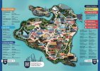
That map is so bland, but I'm glad there's a hint towards Exodus.
I'd probably make it more prominent on there though, since this is going to be quite a remarkable investment for the UK.
 
That map is so bland, but I'm glad there's a hint towards Exodus.
I'd probably make it more prominent on there though, since this is going to be quite a remarkable investment for the UK.
The park confirmed on the passholders group that the map was designed with functionality in mind. I think that anything too stylistic would've been impractical like previous maps.
 
The maps were getting pretty rediculous at one point..

f278c7b0023a8c151240c67ad61b0ebf.jpg
 
The map is really tidy, but lacks soul. Probably quite practical, but you can tell it’s been done by an architect. My bet would be John Burton lead the design; it has hints of ridesims in it.

I think efteling and Disney have nailed how to do a park map. Functional, pretty, and with a bit of character too. Would be great to see U.K. parks lean into this style rather than the extremes of a coloured masterplan or the Where’s-Wally aesthetics, but our parks maybe don’t have enough landmarks or iconic locations to properly anchor down something of that style.
It's from these guys I believe https://attractions.io/
 
Last edited:
Am i the only one that likes the new map? It works, it's a lot more functional than a lot of previous maps? Maybe it's missing some nice ride logos or something, but other than that, i quite like how clean and graphic it is.
I agree, I am a big fan of this simple map. It just works. I do agree about the ride logo thing though.
 
The new map is fine and does its job but it's not very fun to look at.

The best Thorpe Park maps were 2002 to 2007.

2006 was the best year for the park in my opinion. Such a well-rounded ride line-up:

9034547018_f72193cebc_b.jpg

That one is also my favourite map.

Probably a lot of nostalgia and that was when Thorpe was at its peak for teenage me.

Good times.
 
It's funny how easily people forget and believe what they're told.

This map design is not "new". The park have used this style since at least 2021 (maybe even 2020?), with the large map boards around the park. The "return" of paper maps is a mute point, as they actually returned last year, and they had guides for each event with the map too.

That's not to discredit the points raised, just a point to raise.


The map focusing on functionality and directions is alright, but it's a strange contradiction to them saying recently they're not having themed areas as they feel the park is too small and themed areas would confuse people. But heyho. I think the map style is a bit too bland; everything looks flat and nothing stands out. Just adding a bit of 3D-ness and logos for major attractions would do the trick.
 
Top