What's new

Ugliest Ride Stations

CrashCoaster

CF Legend
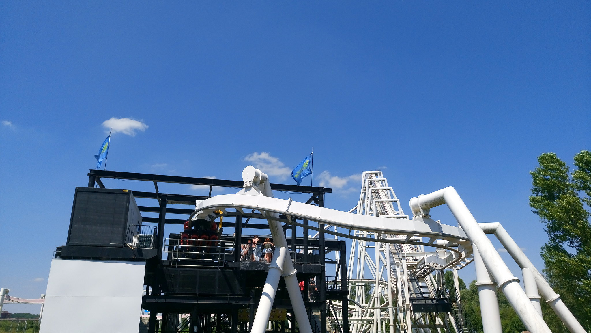
I mean... this topic is literally what it says on the tin. Which rides across the world have the ugliest station/queue buildings, in both interior and exterior? I mean, Velocity's is pretty bad:-
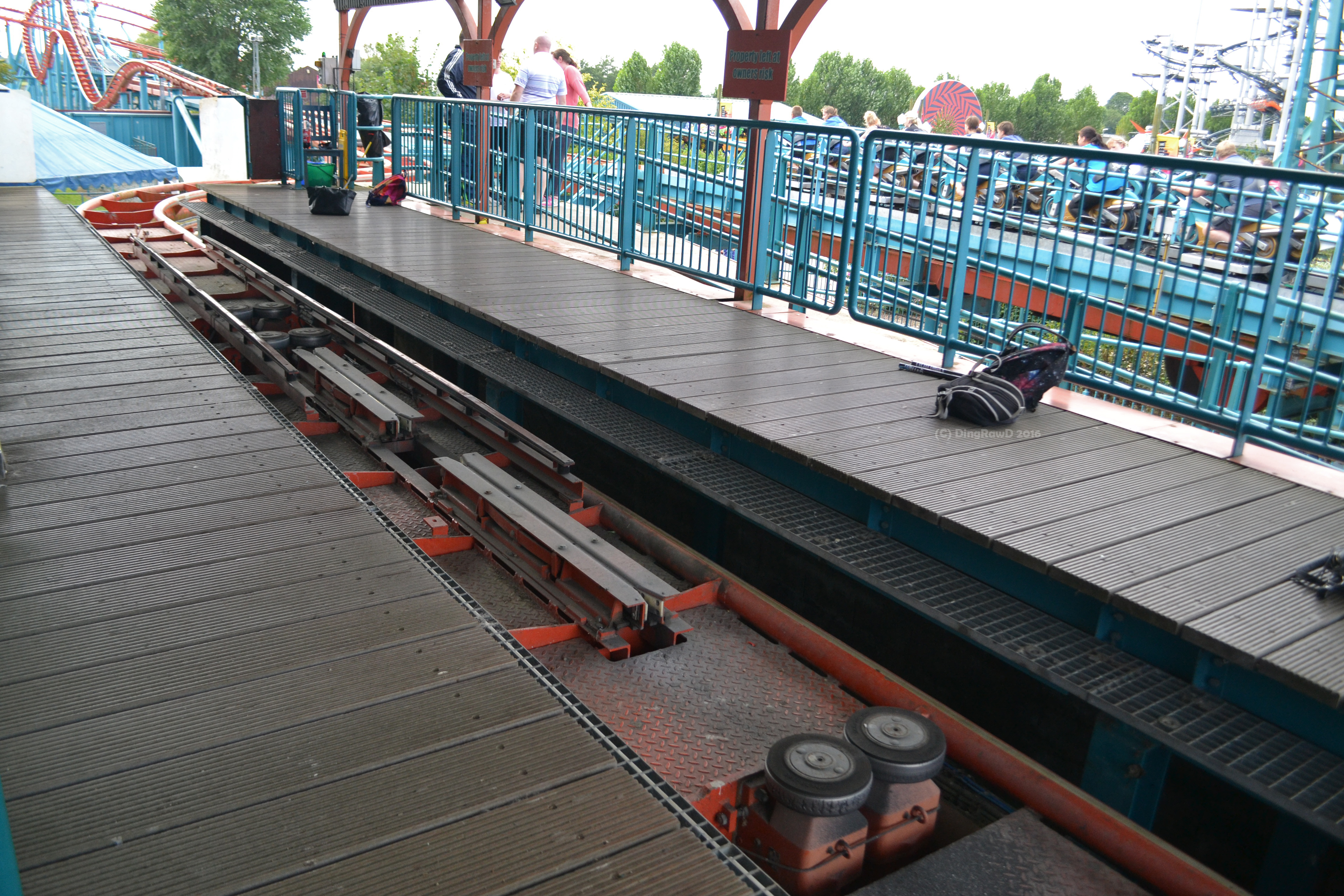
dsc_0076__2__by_dingrawd-dafw1a7.jpg


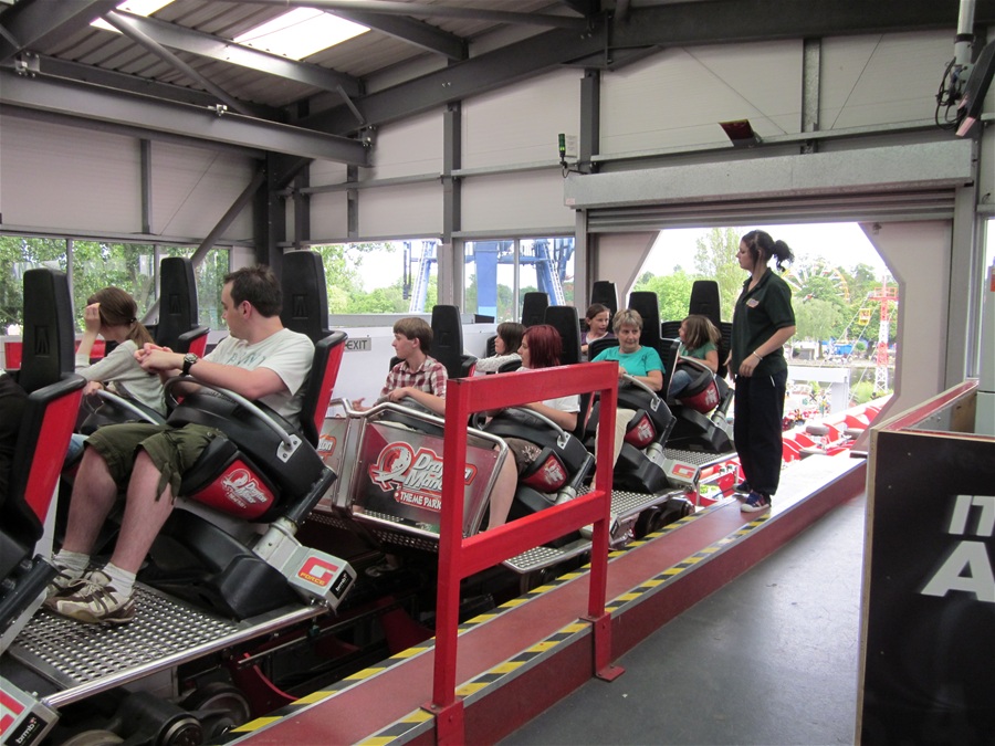
And also G-Force's was pretty bad:-
4272


And I know there's many more.
 
The traveling Zyklons. They're literally metal sheds with temporary stairsteps to get up to their height; they may be very ugly, but it's what can be transported from place to place the easiest.
 
I haven't been on it, but Monster at Walygator's station is so amazingly ugly. It's completely black, roofless, and it doesn't fit at all with the pink and white color scheme of the rest of the ride.
 
Goliath_station.JPG


Goliath at Walibi Holland. Yikes.
After all, this was from the Six Flags era.

I don't mind roofed air-open stations.
Expedition GeForce before they roofed it was also rather ugly. It's almost as if they ran out of money for the station when they finished such a nice coaster...
 
Can I just broad swath nominate all 1990s roller coasters? Coaster designers found obnoxiously large and grandiose facades with jarring colors a great idea for a lot of the decade. But I think my overall nomination goes to Vekoma Flying Dutchmen station designs. Very large overhangs with EXTREMELY large names in case you forgot the title of the coaster (in Batman Forever font, none the less!), yet the insides of these stations were nothing but darkness, sheet metal, and queue lines.

X%20Flight%20large.jpg


Screen Shot 2019-03-12 at 11.23.11 AM.jpg

8914ce2cfddf2fd7928f027d650ddb30.jpg


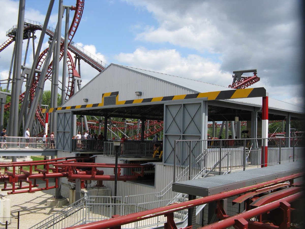
Even relocating X-Flight still yielded the same results - Cedar Fair just built the shed with different colors:

DoHP76UX0AE4Um7.jpg
 
Can I just broad swath nominate all 1990s roller coasters? Coaster designers found obnoxiously large and grandiose facades with jarring colors a great idea for a lot of the decade. But I think my overall nomination goes to Vekoma Flying Dutchmen station designs. Very large overhangs with EXTREMELY large names in case you forgot the title of the coaster (in Batman Forever font, none the less!), yet the insides of these stations were nothing but darkness, sheet metal, and queue lines.

X%20Flight%20large.jpg


View attachment 4680

8914ce2cfddf2fd7928f027d650ddb30.jpg


Even relocating X-Flight still yielded the same results - Cedar Fair just built the shed with different colors:

DoHP76UX0AE4Um7.jpg
Can't wait to see what the station will be like when they rebuild it at Kentucky Kingdom.

Sent from my SM-G955U using Tapatalk
 
Top