You are using an out of date browser. It may not display this or other websites correctly.
You should upgrade or use an alternative browser.
You should upgrade or use an alternative browser.
CWOA | Mandrill Mayhem (World of Jumanji) | B&M Wing Coaster | 2023
- Thread starter Matt N
- Start date
-
- Tags
- chessington new coaster
Crazycoaster
Giga Poster
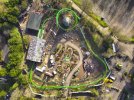
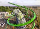
The jaguar statue looks so just.. plonked down. I wish Merlin would work with Universal Rocks, or invest in their own rockwork team. Build some good rockwork structures about and add some near misses (the whole point of a wing coaster is the near misses, is it not?)
spicy
Giga Poster
The jaguar statue looks so just.. plonked down. I wish Merlin would work with Universal Rocks, or invest in their own rockwork team. Build some good rockwork structures about and add some near misses (the whole point of a wing coaster is the near misses, is it not?)
Agreed I really hope there is some rock work yet to be added around the statue.
The park used to have some incredible rock work something like this around the area would be awesome


The theming isn't completed yet mind, and there is no foliage/planting yet either.
It needs a lot of work regardless, only a few months left now.
If they are inviting people in for tours, you still want it to look good and exciting. At this point in time it doesn’t.
I can see this land looking good I’m about 5 years but it’s really not great for opening year. Needs more rocks and hills imo
Sent from my iPhone using Tapatalk
I'veGotFourB&MsInMyGarden
Mega Poster
JoshC.
Strata Poster
It has previously been confirmed that the park will be planting more developed trees/foliage into the area, so hopefully that should help.
Area is looking good enough considering we're still 2-3 months away from opening. I don't like the 'World of Jumanji' in the board centrepiece. It just...doesn't look right, and borders on feeling tacky to me. Maybe it looks better closer up, or they have more planned. But yeah, right now that's what's standing out to me as 'eww'
Area is looking good enough considering we're still 2-3 months away from opening. I don't like the 'World of Jumanji' in the board centrepiece. It just...doesn't look right, and borders on feeling tacky to me. Maybe it looks better closer up, or they have more planned. But yeah, right now that's what's standing out to me as 'eww'
Ethan
Strata Poster
It's all a bit embarrassing, isn't it
Niles
Giga Poster
It deffenetly still has a way to go, once the land opens i hope it does look more full and well planted.It's all a bit embarrassing, isn't it
CineramaMax
Mega Poster
Opening day confirmed to be the 15th of May!
https://www.facebook.com/Chessington/posts/pfbid0PY2Uf1mBDcynLG37arfWyEiAookUJGeS4fptR3VVxru3GPojfD8Nqr3Zx565ayRNl
https://www.facebook.com/Chessington/posts/pfbid0PY2Uf1mBDcynLG37arfWyEiAookUJGeS4fptR3VVxru3GPojfD8Nqr3Zx565ayRNl
spicy
Giga Poster
I don't like the 'World of Jumanji' in the board centrepiece. It just...doesn't look right, and borders on feeling tacky to me. Maybe it looks better closer up, or they have more planned. But yeah, right now that's what's standing out to me as 'eww'
I thought exactly the same. That is such a wasted opportunity, it looks awful.
It should have been a screen showing the green text of the board game quotes, “in the jungle you must wait, until you roll a 5 or 8” etc.. Would have been amazing.

CineramaMax
Mega Poster
Theme Park Guide are live from World of Jumanji now with updates from inside the land
Crazycoaster
Giga Poster
Good to see they managed to get at least one shipping container in there.
The board game in the middle could have looked really good, instead it just looks like a local playpark. Compare it to the walkthrough they just built at Phantasialand in the African section, just worlds apart and I don’t know if it’s because they just lack any sort of creative/artistic talent at Merlin, they just don’t care about quality, or if they scrimp on the budget outside of the rides.
The central glass dome being a flat sign is such a missed opportunity for interaction. Have it so that when people pushed it, it’d bring up a random rule from the first movie etc.
Coasterfreck
Hyper Poster
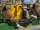
The launch through the station looks quite decent for a family launch wing coaster.
Niles
Giga Poster
freddycoasterkid
Roller Poster
That launch has a kick, kids will be terrified of this 


