FORUMS - COASTERFORCE
You are using an out of date browser. It may not display this or other websites correctly.
You should upgrade or use an alternative browser.
You should upgrade or use an alternative browser.
MARCH 15th- UPDATE!
- Thread starter LiveForTheLaunch
- Start date
LiveForTheLaunch
CF Legend
I really like the detail and the porch thing is cool.
Porch thing? I don't get it
Thanks for all the nice comments though you guys (and girls), I appreciate it!
As for the fence around the pool, fences are actually one of my biggest pet peeves in RCT2. For some reason I have issues with using two different fence types, but then if I use too much of one fence type it becomes repetitive and ugly, so I didn't know what to do.
Ollie
CF Legend
LiveForTheLaunch said:I really like the detail and the porch thing is cool.
Porch thing? I don't get it.
This better not be another one of those Typewriter jokes.
http://en.wikipedia.org/wiki/Porch
Thats a porch. Haven't a clue what you call them in Canada or America. :lol:
LiveForTheLaunch
CF Legend
I know what a porch is, I just didn't know what he was talking about. Hix, do you mean the balconies on the building?
0
00 Tom 00
Guest
LiveForTheLaunch said:Yeah, I prefer RCT2. I had RCT3 for a while but it ended up crashing this computer and costing about $250 to fix so I never installed it again. Two is just way better for pretty much everything.
HHOOWW DDDAARREEEE YOOOUUUU!
Pft, well you're clearly wrong
This building work is looking very very nice, keep up the great work!
Deano
Mega Poster
Tays right. RCT2 IS better. RCT3 slows down after a while and gets irratateing laggy. Also it closes for no reason and makes your PC crash etc... RCT2; there is more choice and stuff.
Already commented on the current work so wont again
Deano . W .
EDIT: Ok, RCT3 has better graphics. But it makes it slow and laggy ^^^ (Y)
Already commented on the current work so wont again
Deano . W .
EDIT: Ok, RCT3 has better graphics. But it makes it slow and laggy ^^^ (Y)
LiveForTheLaunch
CF Legend
Alright, here's a small sneak preview of what is to come. I decided to build a waterpark, but the area in the screenshots is obviously not totally done:
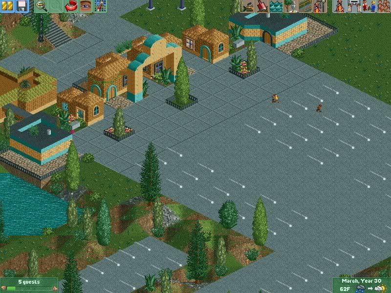
Entrance and stuff
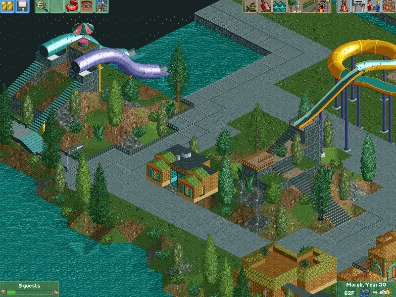
Some slides
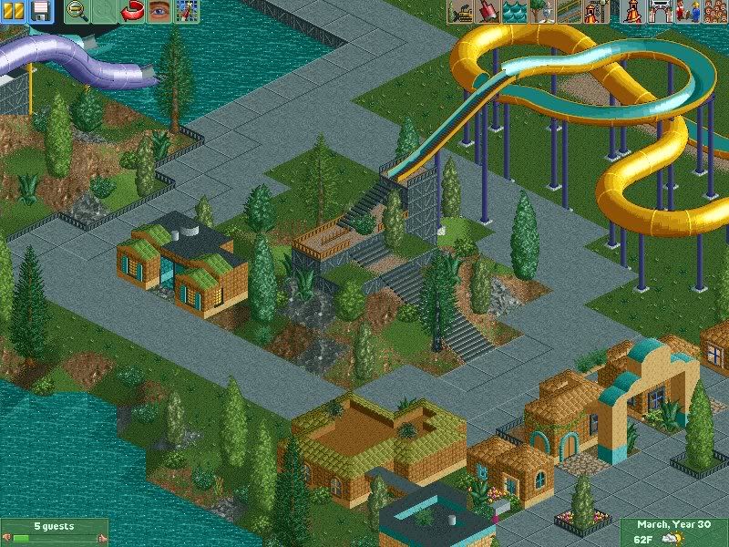
Yellow slide
But yeah like I said, be nice because I'm not done this area yet. I just wanna see what you guys have to say about it so far.

Entrance and stuff

Some slides

Yellow slide
But yeah like I said, be nice because I'm not done this area yet. I just wanna see what you guys have to say about it so far.
LiveForTheLaunch
CF Legend
Thanks, and yeah it's definitely just a start. I still have to add so much more buildings and stuff in the area so if anyone comments on how empty it is, they need to be hit in the head with a brick.
Thanks Deano.
Thanks Deano.
LiveForTheLaunch
CF Legend
*Hits Ollie on the head with a brick*
Anyway, can you elaborate on what you mean by you don't like the terrain? I had to do that because otherwise it's be big staircases and stuff without anything surrounding it like you most often see on waterslides, which would mean even more grey.
Anyway, can you elaborate on what you mean by you don't like the terrain? I had to do that because otherwise it's be big staircases and stuff without anything surrounding it like you most often see on waterslides, which would mean even more grey.
LiveForTheLaunch
CF Legend
I'm confused, haha.
So you said you didn't like it so you'd hav esomething to say, but you actually like it?
Weirdo .
.
So you said you didn't like it so you'd hav esomething to say, but you actually like it?
Weirdo
It's quite good, but I'm not keen on the loading system for the yellow slide. What I suggest doing is getting rid of that bit of lift hill, and just making a staircase that goes up to a platform where they people would be able to stand before jumping down the slide, it would make it much more realistic.
Keep it up though!
Keep it up though!
LiveForTheLaunch
CF Legend
Ew Trav, the stairs look SO bad though. The reason I have terrain is so the stairs will blend in or be a bit blocked by trees. Have you ever seen the dinghy slides where you go up the lift first? I guess that's what I was trying to go for because I didn't wanna make a huge staircase that high, as they look really bad.
I'll try it and see how it looks, but I dunno if I'll like it.
I'll try it and see how it looks, but I dunno if I'll like it.
CedarPoint6
Hyper Poster
^ You can make those stair towers look good, Tay. Talk to me sometime and I'll give you some links. I can also show you how to make some of those slides work.
Right now what you have isn't bad, although I would work more on a semblance or order or planning of your area. It seems to me like a couple squares of path with a slide here and there, and I think you could really benefit from having a waterpark plan so it all works together.
Right now what you have isn't bad, although I would work more on a semblance or order or planning of your area. It seems to me like a couple squares of path with a slide here and there, and I think you could really benefit from having a waterpark plan so it all works together.
