What's new

MARCH 15th- UPDATE!

It looks good, but it's really long walk if you want to re-ride the waterslides. I'm not sure if it's possible, but you could also make the platforms leading up to the slides a tad smaller. You could fit a small kiosk on each of them, as far as I can see.

But overall, it looks really good. Can't wait to see rides.
 
Ollie, if you have ever been to a waterpark (well, I dunno how the waterparks are in jolly ol' England, but over here I mean), you'll see that the colours of the slides are often pretty blinding. Some waterparks like one I went to five or six years ago chose all black and blue for their slides which was ugly.

Pokey, leave it to you to find a detail like "it takes to long to get back to the slide if you want to reride it", haha.
 
Blizzard beaches water slides are Blue and White if i'm not mistaken ;)

But thats a snow themed pace, so yea, carry on...
 
I'm actually starting to like this now. As much as I thought the slides seemed far to big compared to the surroundings, everything kinda.....'fits in' now.
I would say on top of your paths build around it? Like a cagey fence here and there, maybe some interactive water fountains....Catching my drift? Or shall I expand on the comment...?

There's always room for improvements, but you're no stranger to that comment so I won't go on.

Coaster_Monkey
 
Ah yeah I know what you're sayin' CoasterMonkey. With the interactive water fountains and stuff, I definitely think I can add a few things like that here and there.

I won't be able to play RCT2 again for a few days because my mouse malfunctioned one my computer and I'm waiting on a new one.
 
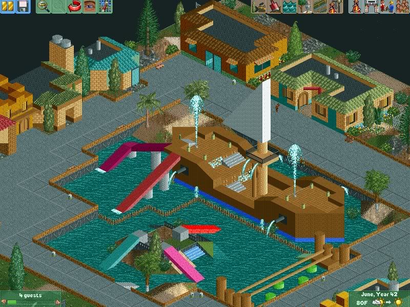
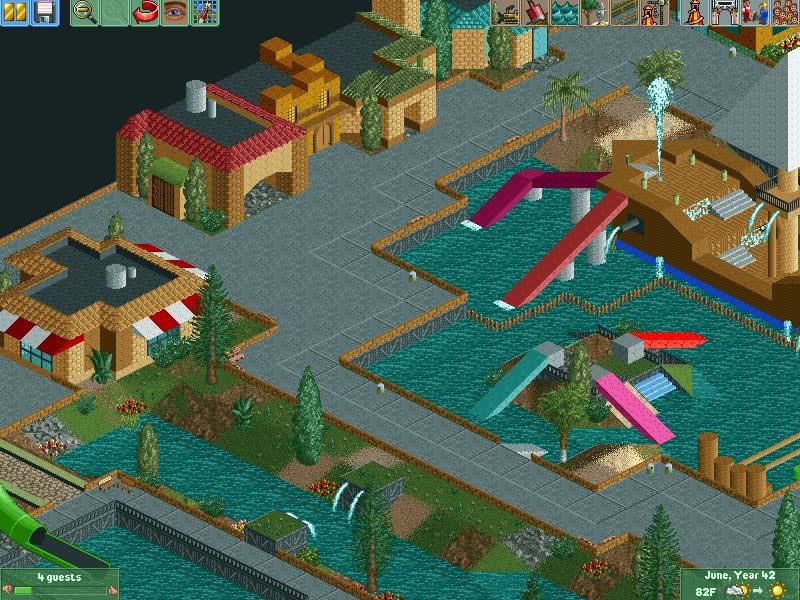
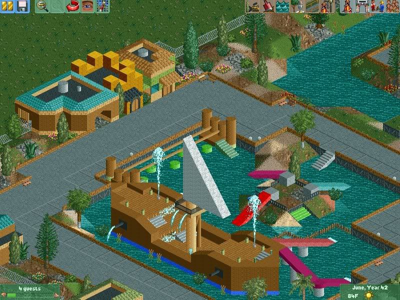
Okay, so I finally got to work on my RCT2 project after not having a computer for the past week. I made an area for kids, which includes a pirate ship, some slides, and a climbey thing. The area also has a lot of stores, etc.

P.S.- My waterpark is like, 99% complete now. All I have left to do is fix any complaints you guys might have about it!

KIDDIE AREA

SCR6-5.jpg


SCR7-3.jpg


SCR8-4.jpg


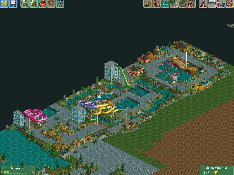
OVERVIEW

SCR9-3.jpg


Enjoy.
 
One Word.

Wow!. That ship thing is rather cool. I like it. Maybe put real slides in it for effect lol. *Picky*

I really like your water park. While small it really is bright and eye catching.

Keep up your work. I love it!.
 
That's really cool, Tay. You're getting better every time. Couple of things I noticed. First, how do they get into the ship in the first place? More obvious ladder or stairs would be good. I guess it's kind of hard, but on the magenta slide that turns, I pictured some little kid sliding off at the corner and hitting that wall. Same with the small light blue one... right into the wall. I must say, what I'm picturing is pretty funny.. but anyway-- sides would be good if you can (which you can with the objects you have!). Anyway, things are looking good-- and I'm still coming with that tree tutorial thing I told you I'd do.
 
Thanks guys. Positive comments are always exciting when they come from two of the best RCT2 players on CoasterForce.

As for the pirate ship, I knew someone was going to notice that there weren't stairs going up to the ship. I'll add them in though, for sure. The slides however, yes I'll make them farther away from the walls, but I had actual slides there and it looked retarded; the slides looked way too big, so I went with these instead.

Thanks.
 
Woah, thats great! But the kids will fall of the edges of the slides ;)

The ship looks really good, it must have taken a while, and this kiddie area is a nice touch to the park!

Great stuff!
 
Im not going to babble on, I think it's great.
1 Thing - real slides as CD said?

Great. :wink:
 
Deano, I know what you mean about the kids falling off of the slides, but there's not much I can do to fix that, unfortunately.

The ship only took me about an hour an a half to be honest.

Im not going to babble on, I think it's great.
1 Thing - real slides as CD said?

Again, I can show you guys how horrible it looks with real slides, lmfao. You'll then see how much better it looks now than it does with real ones :p .

Thanks for the comments.
 
I don't like it when people point the negatives of yuur parks. as seen through out your topic. no offence to anyone. :p.

But. You try. and simply what else could you ask for. Saying poeple will hit the wall. LOL. meh. I say. Picky.

I will say the positive things of your park. :D

The Ship - Wow. creative. New. Fresh and stunning.

The water park- relistic, Amazing buildings, small, copmpact, easy to navigate. Simple.

The Shops - Modern, Relsitic (Mcdonalds there everywhere).

See Just Love all round.
 
Thanks Cedar Dude; as for the negative comments, I enjoy them as long as they're constructive. I mean, I'd be a little bit pissed if someone came in here and told me it was crap and then didn't elaborate. As for being picky, a lot of people are; I try for realism but I don't go out of my way to make sure people don't hit walls and all of that.

Thanks though, dude.
 
Hmm, I'm a noob at RCT2, so I don't know if it's possible, but can you make the sail a tad thinner? I mean, have a look at real sailships and copy some sails from there. I don't say you need extensive sail- and ropework, but that triangle doesn't look good at all.
And your slide stairs still look like carpark towers :--D

Otherwise, this is stunning. Great level of detail and realism, and very few things to pick on.
 
Hmm, I'm a noob at RCT2, so I don't know if it's possible, but can you make the sail a tad thinner? I mean, have a look at real sailships and copy some sails from there. I don't say you need extensive sail- and ropework, but that triangle doesn't look good at all.
And your slide stairs still look like carpark towers

I can't make the sails any thinner, as there aren't any thinner triangle pieces.

As for the slide stairs, they look pretty much how most slide stair towers look. I don't know how yours look in Norway :p .
 
I like, although i like the sound of that canopy by the hotel :) :idea:
 
Top