What's new

MARCH 15th- UPDATE!

Okay, so here is the almost complete (well, it's done, but I think I might add one more building) shopping outlet. For the TGIF and the other restaurant, you can't say they're unrealistic, as they're copied right off of pictures on Google :lol: .
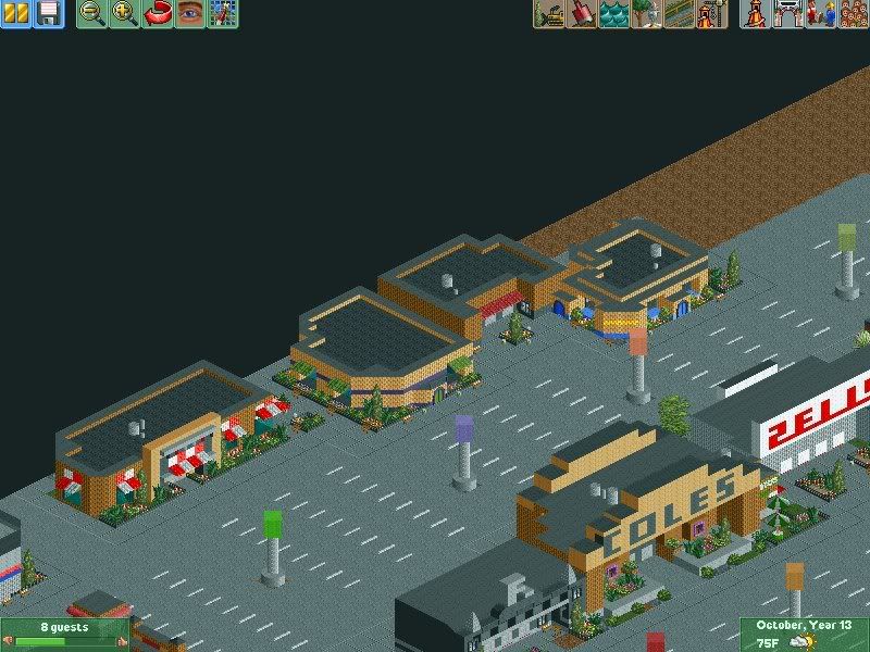
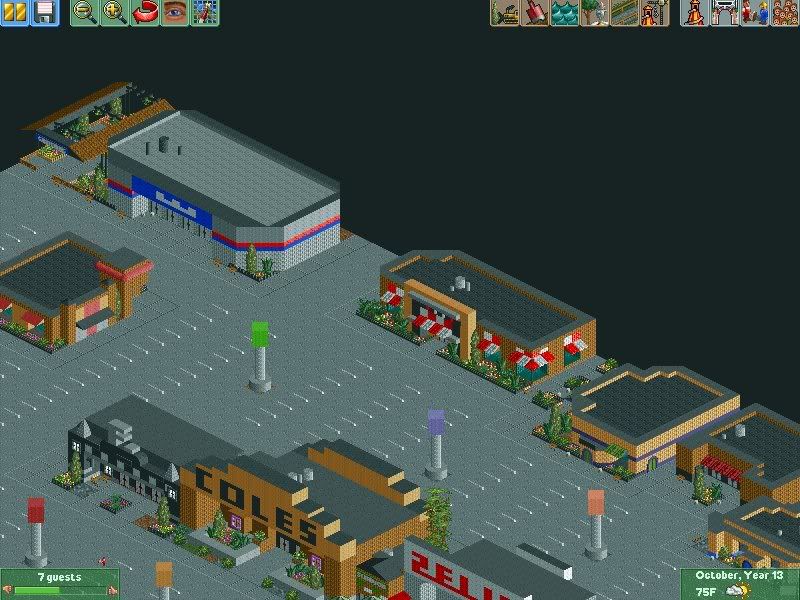
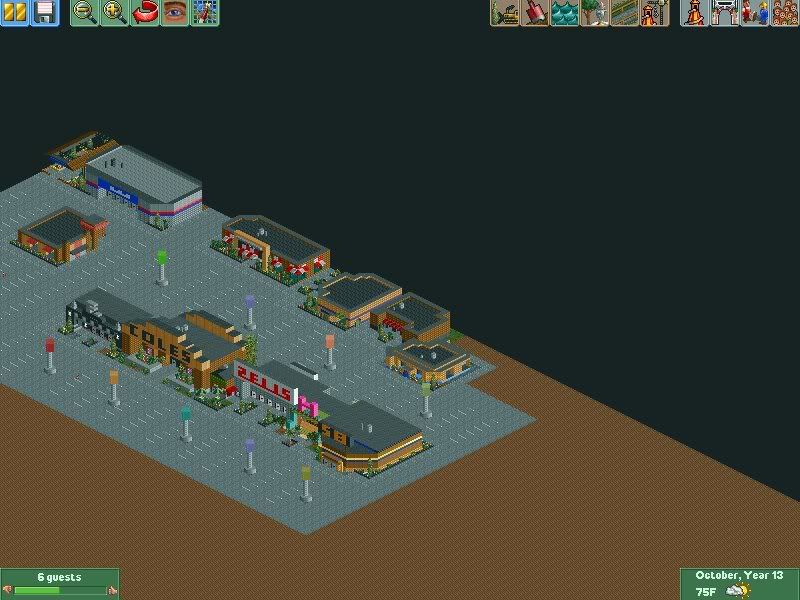
SCR7.jpg


SCR6-1.jpg


SCR5-2.jpg
 
It's looking really good.

It's probably one of the better pieces of non-park building and theming.

I really like the canopies around the restaurant.
 
Really big shame you had to start again, it was looking really good!

This new park looks good still, but its to car parky IMO. The other park had more colour and life, if you know what i mean?

Soryy but this isn't as good, YET. Still, might get much better.

If you had saved the file on a disk, you could have replace the corrupted file. Shame :\

Still, its not bad by any means.

Hope this turns out as good as the other one was going.
 
Haha I don't have the corrupted file on a disk or anything, so this will have to do.

And yeah I know exactly what you're saying Deano. This is a bit too grey, so I might add more trees and buildings around the car park. As for the old stuff, well, as I said I'll copy the Holiday Inn but I'm not gonna use that pink and purple hotel. We'll see, I mean, I'm just trying to make it as realistic as possible.
 
Yea, trees would add some colour, as long as there not Brown autum trees :lol: Good, the Holiday Inn's coming back.
 
O kool, cant wait, and just looking back at previous posts, i really hope there will be a Mc D's again. We'll see in tha next up-date though,
 
It looks pretty decent.
The parking markers or whatever you would like to call them shouldn't be in the middle of the lanes though.
 
O kool, cant wait, and just looking back at previous posts, i really hope there will be a Mc D's again. We'll see in tha next up-date though,

As I said, a clone of the old McDonalds and the Holiday Inn WILL be in my park for sure.

The parking markers or whatever you would like to call them shouldn't be in the middle of the lanes though.

Thanks for the comment, but I'm not going for like, complete realism. It looks realistic, so that's all that matters really. I mean, I don't have shelves in my stores, but they LOOK like stores on the outside, so they do their job.

I've worked on it a bit, but nothing to warrant an update just yet!
 
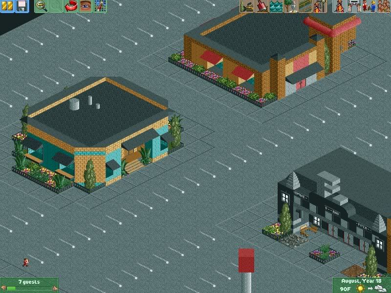
Just a small little update!

SCR8-2.jpg


One more building I added to the shopping complex thing, to try to break up the big chunk of parking lot in that area.

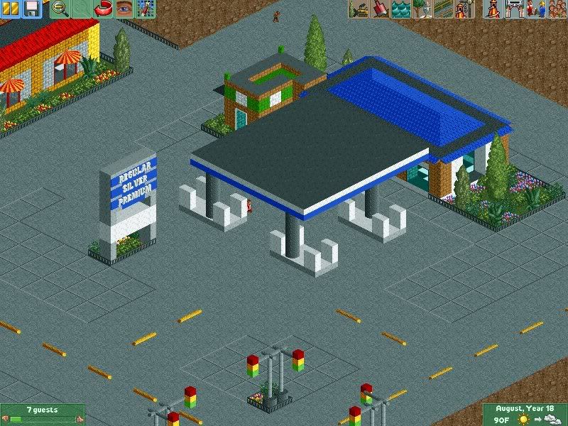
SCR9-2.jpg


A gas station and a little Subway.

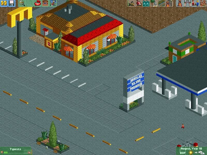
SCR10-3.jpg


And due to popular request, the McD's is back.
 
It's all pretty decent.
The architecture isn't the best but keep at it.

Well, though I know my architecture isn't up to par with like, Coaster Monkey or CP6, I wouldn't say it's bad. If you look at some of my older stuff I've come a pretty long way :p .

Also just as a thing of note, 90% of my buildings were inspired by a real building, and if not that, I tried to duplicate a lot of them from real pictures of buildings on Google.
 
Nice Gas station and Mc'D's looks good too, most of the buildings here are really good. And its realistic.

Do you know when the theme park itself will be constructed? Rides etc...
 
Right Tay, I have one concern,
I know it's some like super complex, but im conerned about the over use of concerete and could it potentially be over used to look tacky? I mean, I totaly understand it's a complex, and it's going to have multiple roads and paths, but maybe it's being overused? I dont know, it's something I cant justify at the moment.

Apart from that, the archi looks good, Nice work. Cant wait for the installation of rides, etc.

Good luck Taylor, and keep working hard. :)
 
^I agree.

Tay, maybe to break it up a bit, try and raise the pathways a bit as they look too low down. ;)
Looking really good though, and like everyone else has said 'can't wait for some rides'.
Although I know that your gradually working your way across the workbench and will get to it as and when. :p
 
Yeah I know where you're going with the concrete look thing, and I think I'm just gonna add a few more buildings in that area on the other side of the street that way the concrete won't be as visible because they will be blocking the view to the massive parking lot. I definitely agree though, and I'll try my best to make it work.

As for the park, I think I'm gonna start that next and then come back to this part later.
 
LiveForTheLaunch said:
I'm just gonna add a few more buildings in that area on the other side of the street that way the concrete won't be as visible because they will be blocking the view to the massive parking lot. I definitely agree though, and I'll try my best to make it work.

If you are going to do that, may I suggest one thing? Try and make the buildings a bit more colourful. Not grey or black, cos that will just contribute the the place looking dull and more industrialised.

The Yellow & Red McD building looks good. Try experimenting with different, brighter colours.

Nice work, Good luck.
 
How about a nice colourful children's play area? Or a garden centre. Something that will brighten the area up.
 
Top