FORUMS - COASTERFORCE
You are using an out of date browser. It may not display this or other websites correctly.
You should upgrade or use an alternative browser.
You should upgrade or use an alternative browser.
Superman: Ride of Steel... 2?
- Thread starter Ben
- Start date
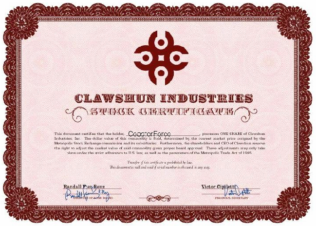
For those interested, CoasterForce was able to grab stock in Clawshun Industries! :razz:

Clawshun Industries is starting to show it's true color, as Lex Luthor, famed Superman Villain, sent this email to share holders.

Further, the Clawshun Industries website has added the mention of "eradicating the Superman shrine" in referring to RoS.
The plot thickens.

Clawshun Industries is starting to show it's true color, as Lex Luthor, famed Superman Villain, sent this email to share holders.

Further, the Clawshun Industries website has added the mention of "eradicating the Superman shrine" in referring to RoS.
The plot thickens.
There's more of them here - http://themeparkreview.com/forum/viewtopic.php?t=46306&postdays=0&postorder=asc&start=160
And they again, back up the Lex Luthor theme.
And they again, back up the Lex Luthor theme.
A
Anonymous
Guest
i think the purples alright.
The green wouldn't look to good though.
I also back up Lex Luthor Theme

The green wouldn't look to good though.
I also back up Lex Luthor Theme
LiveForTheLaunch
CF Legend
Damn, I haven't looked at this topic in forever, and am just realizing right now about the whole purple thing. I don't really see how it's bad, like, purple is a really nice colour, especially for coasters, but the only thing is, they already have a dark purple coaster, so that would be kinda whack.
Oh well, paint the supports something nice and bright and that will be fan-tas-tic.
Oh well, paint the supports something nice and bright and that will be fan-tas-tic.
Slash
Giga Poster
^ The only problem with purple paint is that the coaster is based on "Superman". Since I remeber Superman didn't wear purple or use any purple objects so I think they should keep it red. BUT as its Lex Luthor, hell yeah, purple FTW. I'll just say I'd prefer it as Superman than Lex Luthor.
