FORUMS - COASTERFORCE
You are using an out of date browser. It may not display this or other websites correctly.
You should upgrade or use an alternative browser.
You should upgrade or use an alternative browser.
Thorpe Park | Hyperia | Mack Hyper Coaster | 2024
- Thread starter Matt N
- Start date
-
- Tags
- 2024 new coaster thorpe park
spicy
Giga Poster
Struggling to think of positive things to say about the new logo, it's properly bland and boring. I can't see where the actual marketing potential is in it. The last logo had the infinity sign, and they were able to make good use of it all the time. What they gonna do with this one? include a pissed up 'o' on everything?
.
Pissed up O as a back drop seems to be the plan


As has been said they used the Infinity logo all the time for their events and it was associated with TP.
The timing seems all the more bizarre when the infinity logo could have been used in marketing with the silhouette of Hyperia’s layout being very similar to it.
Which is kind of the direction I thought they were going in with the silhouette graphic near BK.

Definitely thought they were going to use the Hyperia layout silhouette with the infinity logo.

As has been said the logo is just so generic and bland. They can’t really do a whole lot with it for brand recognition as it’s just some text.
I’m sure everyone will get used to it eventually but at the moment it gives me these vibes..

davidm
Strata Poster
The new logo looks good on that Hyperia poster above, but that's about the only place it does.
I did find the old logo a bit "comic sans" though - the infinity thing was OK but the font notsomuch. Odd that the have gone just for text now (but that's the "modern thing" I guess). That "e___" is going to bug me though
I did find the old logo a bit "comic sans" though - the infinity thing was OK but the font notsomuch. Odd that the have gone just for text now (but that's the "modern thing" I guess). That "e___" is going to bug me though
Projektion
Mega Poster
One day after the new logo reveal and somehow it already looks dated.Pissed up O as a back drop seems to be the plan

Disco Lumberjack
Mega Poster
I think the new logo inspires no passion, but the previous one was worse. There is an advantage to it being relatively basic, which is that it can be added to a diverse array of designs very easily. Some of the posters and example merch that I've seen look much better with the new logo than they would have with the old. It has grown on me over the past day.
Coasterfreck
Hyper Poster
More progress has been made on the the supports for the non-inverting Immelmann and dive loop.
endermanloveH20
Mega Poster
Question: What did you all think of the hyperia snippet of the soundtrack?
Sent from my iPhone using Tapatalk
Sent from my iPhone using Tapatalk
spicy
Giga Poster
Question: What did you all think of the hyperia snippet of the soundtrack?
Sent from my iPhone using Tapatalk
Thought it was fantastic..
Nicky Borrill
Strata Poster
Really liked it… Could end up being one of my favourite UK soundtracks (currently Icon.)Question: What did you all think of the hyperia snippet of the soundtrack?
Sent from my iPhone using Tapatalk
CineramaMax
Mega Poster
From the snippet we heard at the IMAscore event, it was a top tier coaster soundtrack, probably Thorpe's finest.
Nicky Borrill
Strata Poster
It's on the Official announcement trailer too...From the snippet we heard at the IMAscore event, it was a top tier coaster soundtrack, probably Thorpe's finest.
Here, if anybody hasn't heard it / seen it, or has and wants to watch again.
CineramaMax
Mega Poster
It is, but the instrumentation is different from the snippet they played for us. I think it was just an edited down version of the longer ride soundtrack.It's on the Official announcement trailer too...
Here, if anybody hasn't heard it / seen it, or has and wants to watch again.
Nicky Borrill
Strata Poster
Maybe it was a WIP?It is, but the instrumentation is different from the snippet they played for us. I think it was just an edited down version of the longer ride soundtrack.
Thorpe announced on Twitter / No way out that this was the official soundtrack.
Or maybe you're right and it was just a different mix of the soundtrack for queue, station or on ride etc...
Coastiesaurus
Roller Poster
Soundtrack reminds me a bit of Flight of the Sky Lion
I'veGotFourB&MsInMyGarden
Mega Poster
Filming for Hyperia's TV advert begins today and it's not taking place in the UK.
This was all confirmed by Thorpe Park in the chat of Dominic Gardener's livestream yesterday evening.
Looking forward to seeing it on the telly in the near future!
This was all confirmed by Thorpe Park in the chat of Dominic Gardener's livestream yesterday evening.
Looking forward to seeing it on the telly in the near future!
Niles
Giga Poster
Sadly due to traffic and going late i missed my chance to head down monks walk but i have a couple more chances over the next weeks to 
However i did drive past at night on the M3 and.........oh my, seeing it was amazing. It looks great on the skyline and that outerbank turn does look phenomenal.
Here is an update however: Source
More supports have gone up.
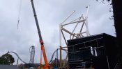
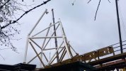
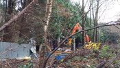
The old railway house is being demolished.
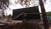
And work on the station continues.
However i did drive past at night on the M3 and.........oh my, seeing it was amazing. It looks great on the skyline and that outerbank turn does look phenomenal.
Here is an update however: Source
More supports have gone up.


The old railway house is being demolished.

And work on the station continues.

VonRolland
Giga Poster
Good old Merlin black box station
VonRolland
Giga Poster
You'd hope wouldn't you, maybe they'll slap the new logo on itIsn't this side only visible from back of house? I'm sure the visitor-visible side will look better.

