Crazycoaster
Giga Poster
^ Which game, there are three Halos..
The rides actually inspired by Half life, a sort of predecessor to Halo.
The concept of my ride was to have an immersive queueline too, cause basically its mostly inside, exploring this abandoned base. It'd be like one of those halloween haunt walk through, not for the faint hearted. Except without people jumping out at you and more emphasis on mystery.
It utilises claustraphobia, by having a series of narrow, low ceiling'd corridoors, with flickering lights and atmospheric sounds to add to the whole experience. You'll pass through many different room scenes, that will explain the story as you get further and further into the base until you reach the lab scene (and station) where you'll then board the train!
Its quite a unique queueline, for example at one stage the way you want to go is blocked, so you have to traverse through a lockeroom and the remains of destroyed employee bathrooms to get to where you want to go.
Then we have the ride itself which will be an intense experience right to the end finale, which will hopefully suprise first time riders as the monsters are revealed properly in the 'Mutation Cavern'.
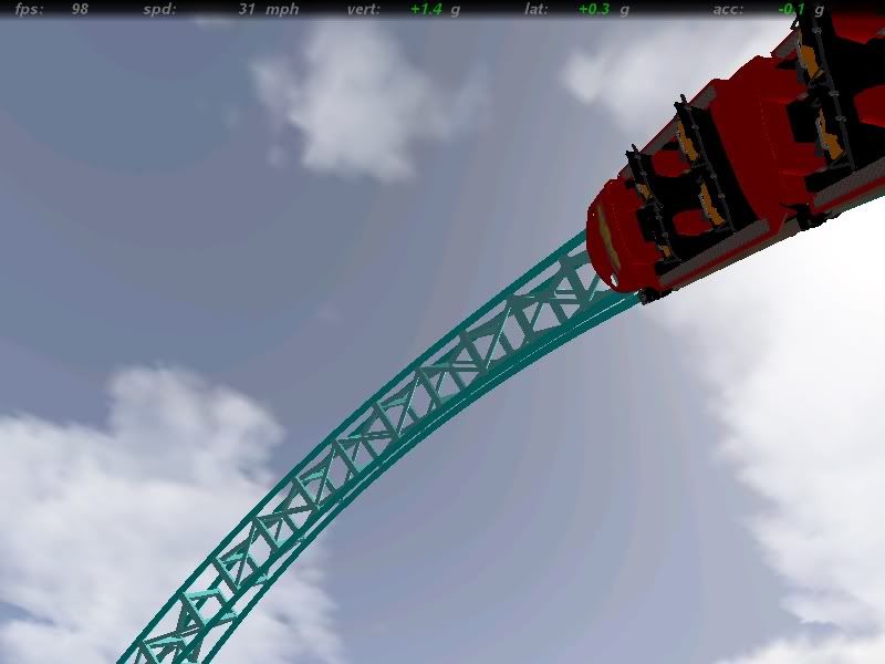
What does that mean? Firstly I used the cartextures that came with the game, and edited ontop of it adding my own colours and design. Its sort of a game of guessing as to what bit goes where, but with a bit of trial and error you'll get the feel of what each bit of the graphic represents on the train, then you go from there.
The rides actually inspired by Half life, a sort of predecessor to Halo.
The concept of my ride was to have an immersive queueline too, cause basically its mostly inside, exploring this abandoned base. It'd be like one of those halloween haunt walk through, not for the faint hearted. Except without people jumping out at you and more emphasis on mystery.
It utilises claustraphobia, by having a series of narrow, low ceiling'd corridoors, with flickering lights and atmospheric sounds to add to the whole experience. You'll pass through many different room scenes, that will explain the story as you get further and further into the base until you reach the lab scene (and station) where you'll then board the train!
Its quite a unique queueline, for example at one stage the way you want to go is blocked, so you have to traverse through a lockeroom and the remains of destroyed employee bathrooms to get to where you want to go.
Then we have the ride itself which will be an intense experience right to the end finale, which will hopefully suprise first time riders as the monsters are revealed properly in the 'Mutation Cavern'.
Xpress said:Which of those little pictures did you use, Crazycoaster, for your cartexture?
What does that mean? Firstly I used the cartextures that came with the game, and edited ontop of it adding my own colours and design. Its sort of a game of guessing as to what bit goes where, but with a bit of trial and error you'll get the feel of what each bit of the graphic represents on the train, then you go from there.


